Beneath the Waves
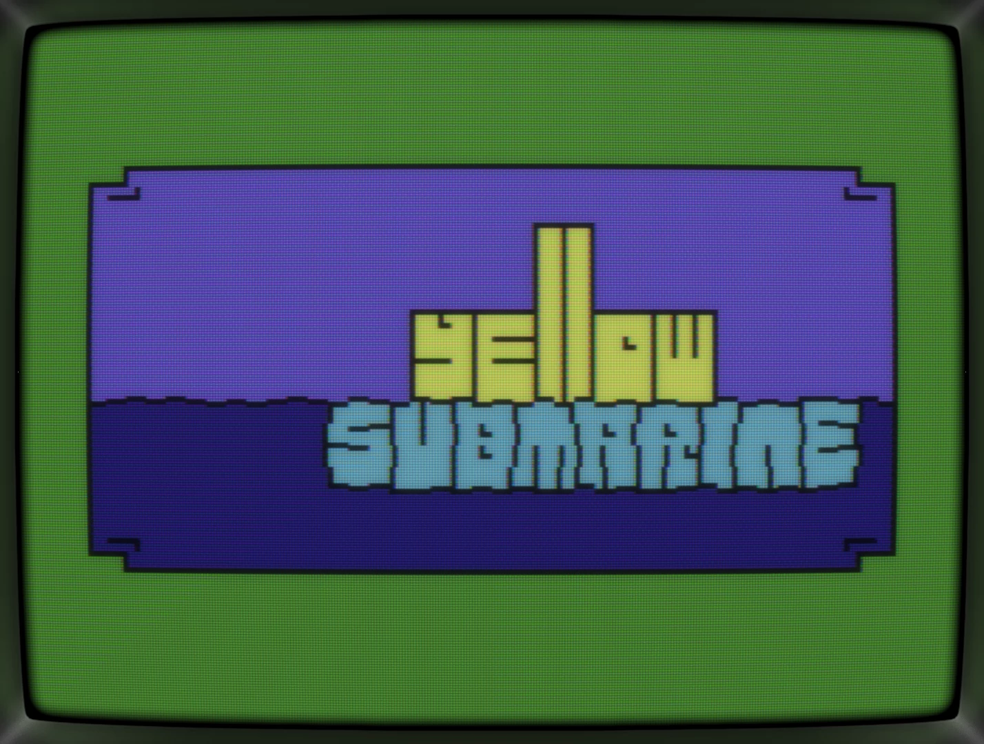
How it started
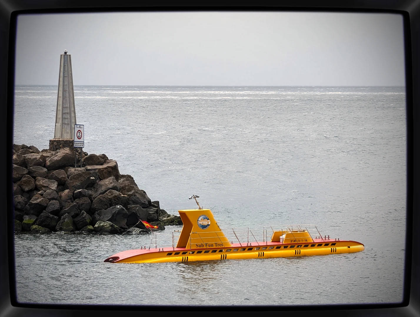
While on vacation on Lanzarote, I spotted a real yellow sub and that's all the inspiration you'd need really, right?
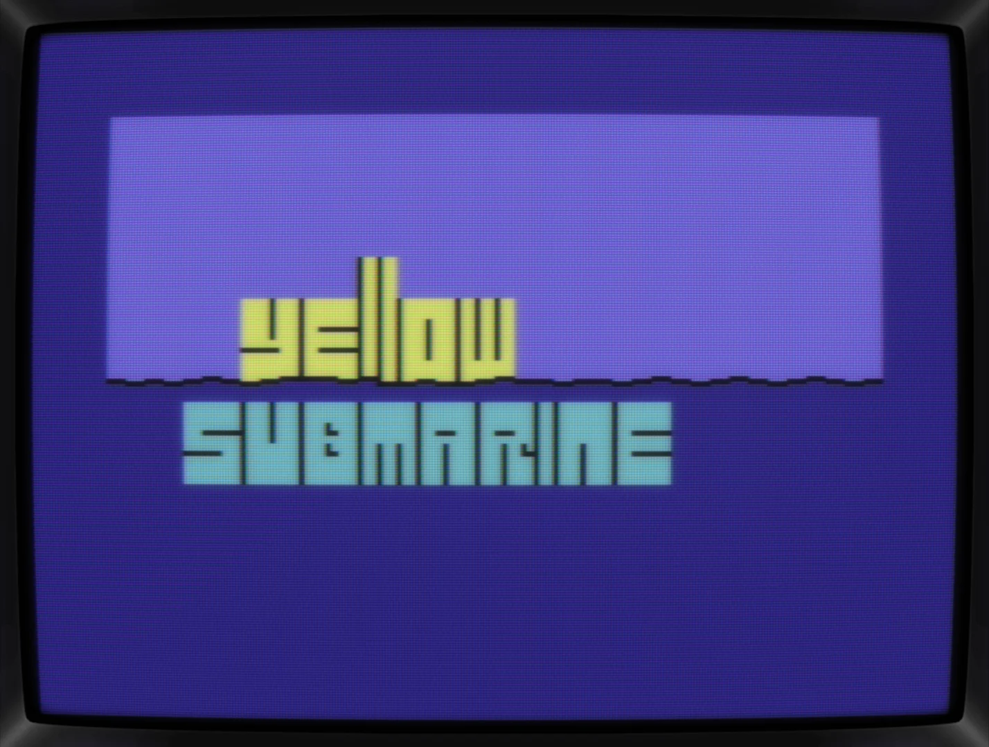
The main idea with having one part above the water line and the other one below it was there right from the start and getting both strings working was no problem either.
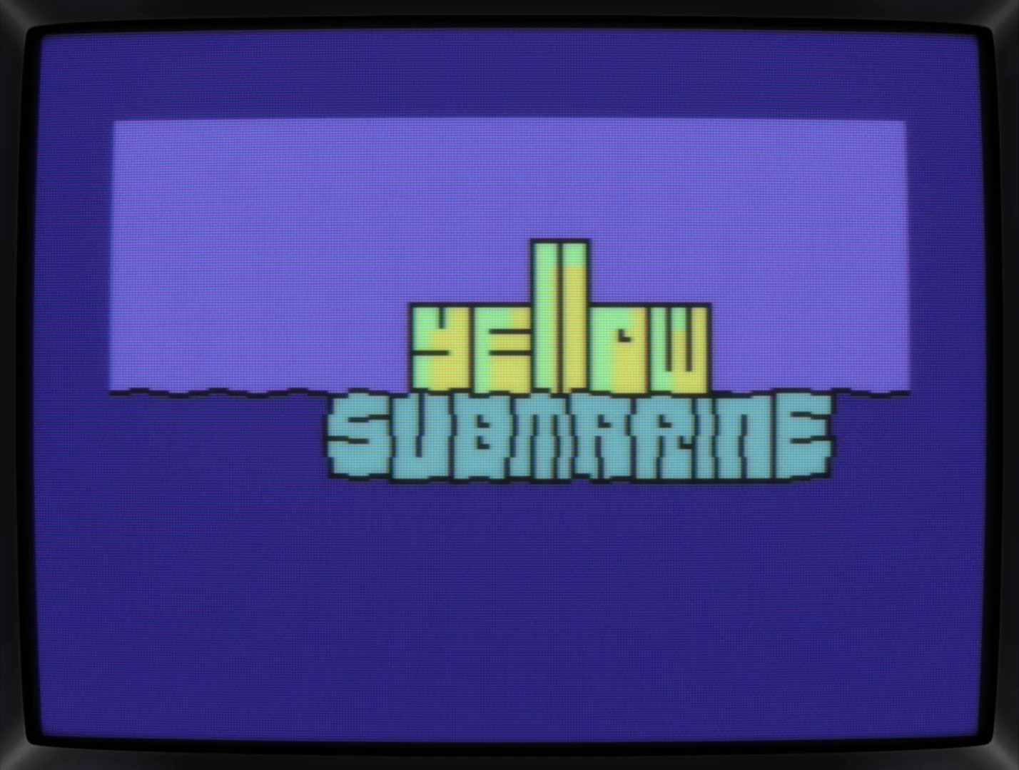
The real kicker was when deciding to make it one shape and submerging the lower part. To my surprise, this only took a couple of minutes to do, with the variations being rather limited thanks to the corners of the chars.
Adding a black outline to it was needed and, again, just a quick change of a few chars.
I already liked the pic and it's flow, but having only put in mere minutes, I felt like it's not sophisticated enough. Also, it is a "Yellow Submarine" but not the one from the Beatles movie, so I googled a still image and tried to match my sub with the real one.

Eh,... it works, kind of, but not really. Maybe, a lot of tweaking would lead to something good looking, but IMHO losing the wavy part was not worth it.
Back to the initial idea and let's tweak the font a bit. Goal was to reflect the sub's roundness and chubbiness while keeping the hard edges of the above the water partand the wavyness of the submerged one intact.
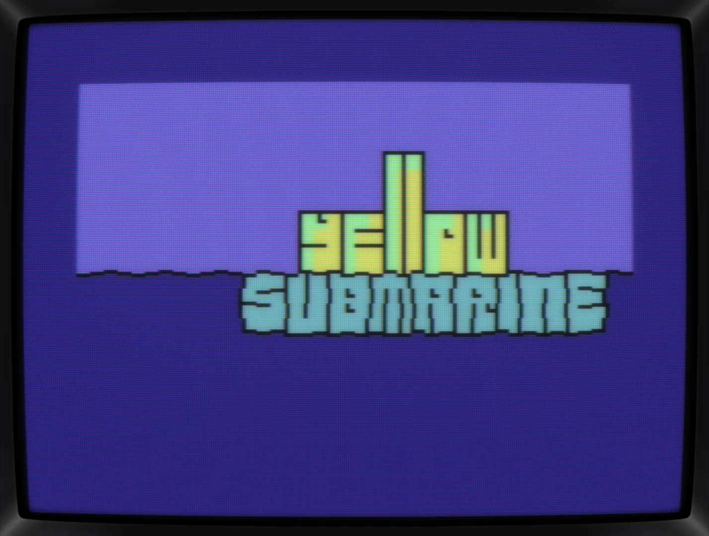
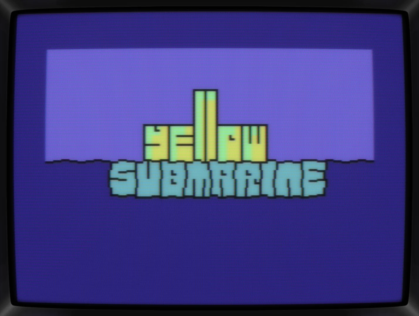
Quest for the holy border
The logo's done for the C64GFX.com Charset Logo Compo, so while splitting the border color would be the way to go (which I wouldn't know how to do), it's not a valid option. What's needed here is some kind of border to frame the pic.
First idea was having the sub floating above the deeper and darker unknown. With the black border, the colors do pop but the overall tone does change dramatically too. Not sure I wanna lose the logo's positive vibes.
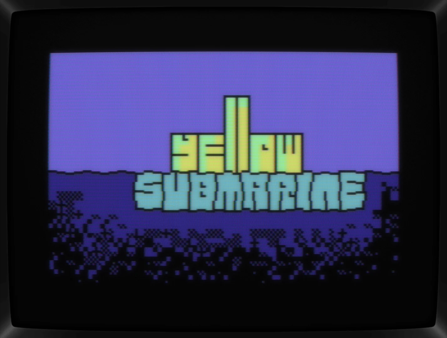
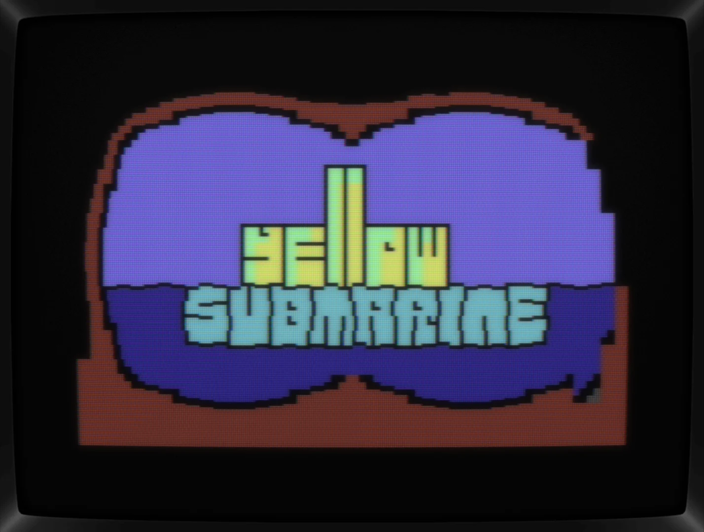
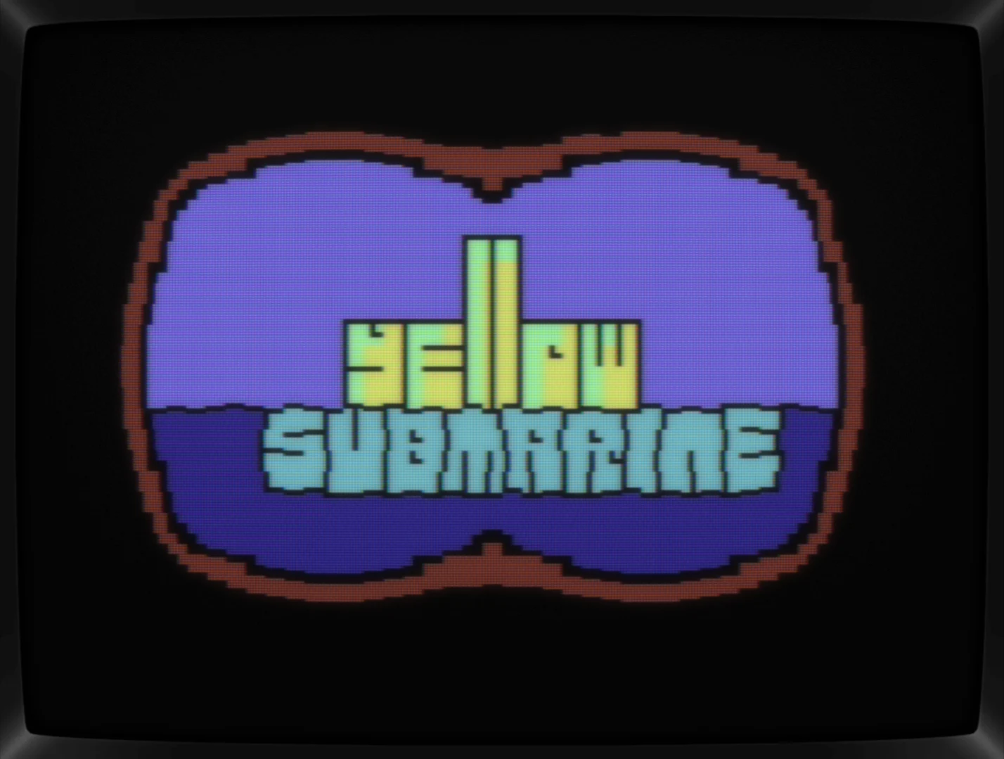
Next up, binoculars. It was a nice exercise painting that round border but this idea doesn't work either. There's just not enough room to fit in both with the needed space inbetween.
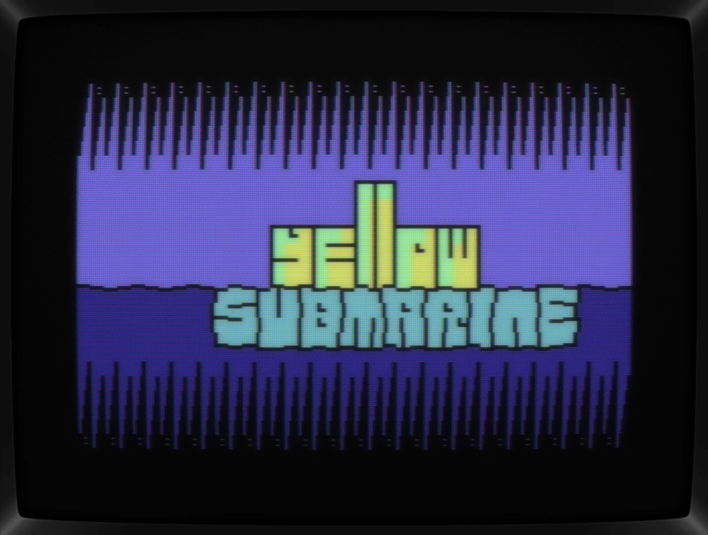
Next up, let's visualize the logo as part of an intro, so a repeating pattern above and below the logo could be the way to go but no, way too many lines wasted here for a rather agressive looking border. Maybe it would have worked if there was some movement to it, but again, still image for the compo, so we'll never know.
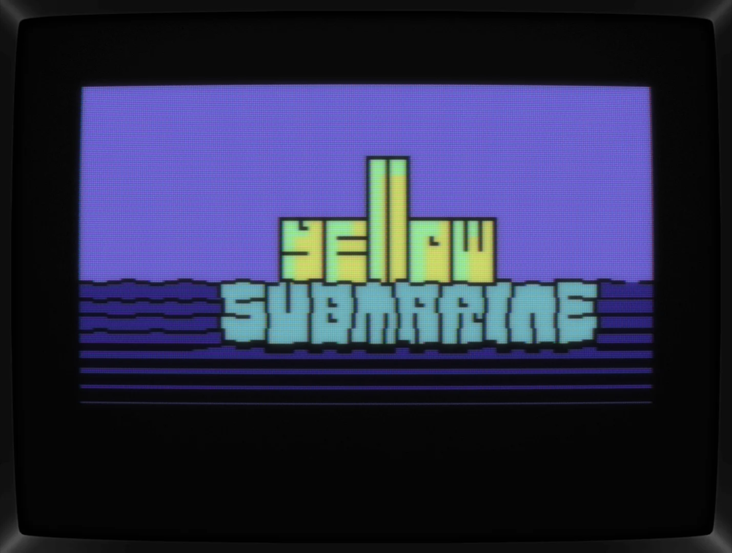
Last try, fading out the blue color. Well, yes, that's working but it also creates a thicker than intended outline of the lower string. And it's asking for even more raster bars and stuff that can't be done. But definitely an idea too fool around with sometime later.
Huh? What's that? A green border with a single black line and small acsents in its corners?
To be honest, it was a "let's try something completely different"-idea and it stuck right away. For me, the color combination works beautifully and "sea of green" might pop into someone's brain too, even though the sea and the green aren't really combined here.

Conclusion
Sure, it's not really a logo, not even a good one, but it's giving off a positive vibe and there's a little chuggle in there too. It still makes me smile, so I'm happy with it.
What's CSDb thinking about it
Nice! I love the distortion effect on the underwater lettersit's really well executed.
Creative!
Hey all right! Nice!
Thanks! Had a really hard time framing it until I just went with a simple (maybe too simple) frame. IMHO, the green works nicely though.
Very nice fresh idea!
I almost see how it waves :)
Neat & wavy, I like it.
Nice work.