Color GP PETSCII

How it started
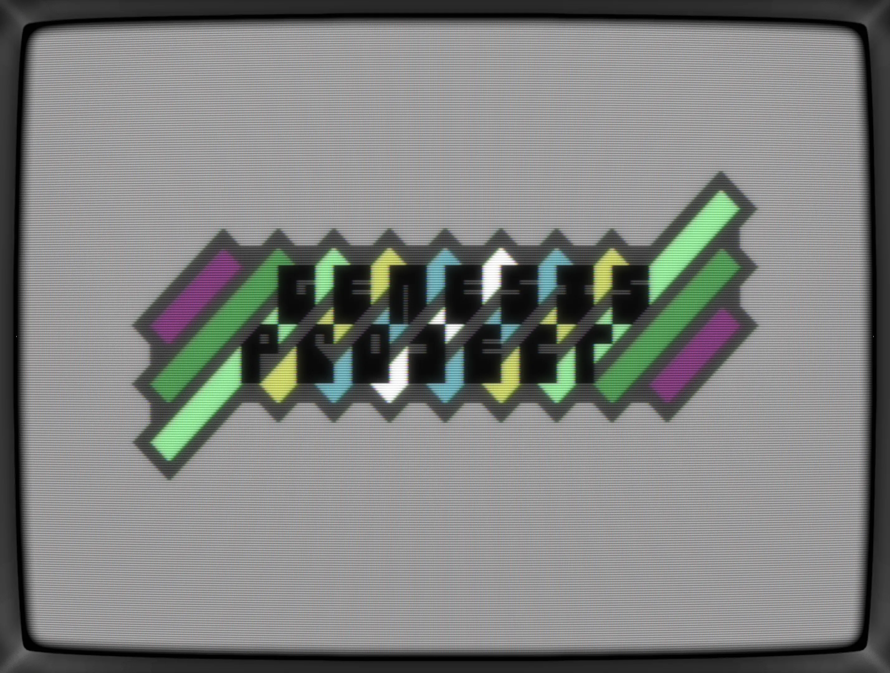
Clearing up my folders in order to share them with F4CG folks, I've stumbled upon two undone logos from the C64.com CharSet Logo Compo 2024 and one was a minimalistic one for Genesis Project. It was my first time doing a font and I quite liked the idea of a cut off edge merging into a diamond, it was a bit rudimentary.
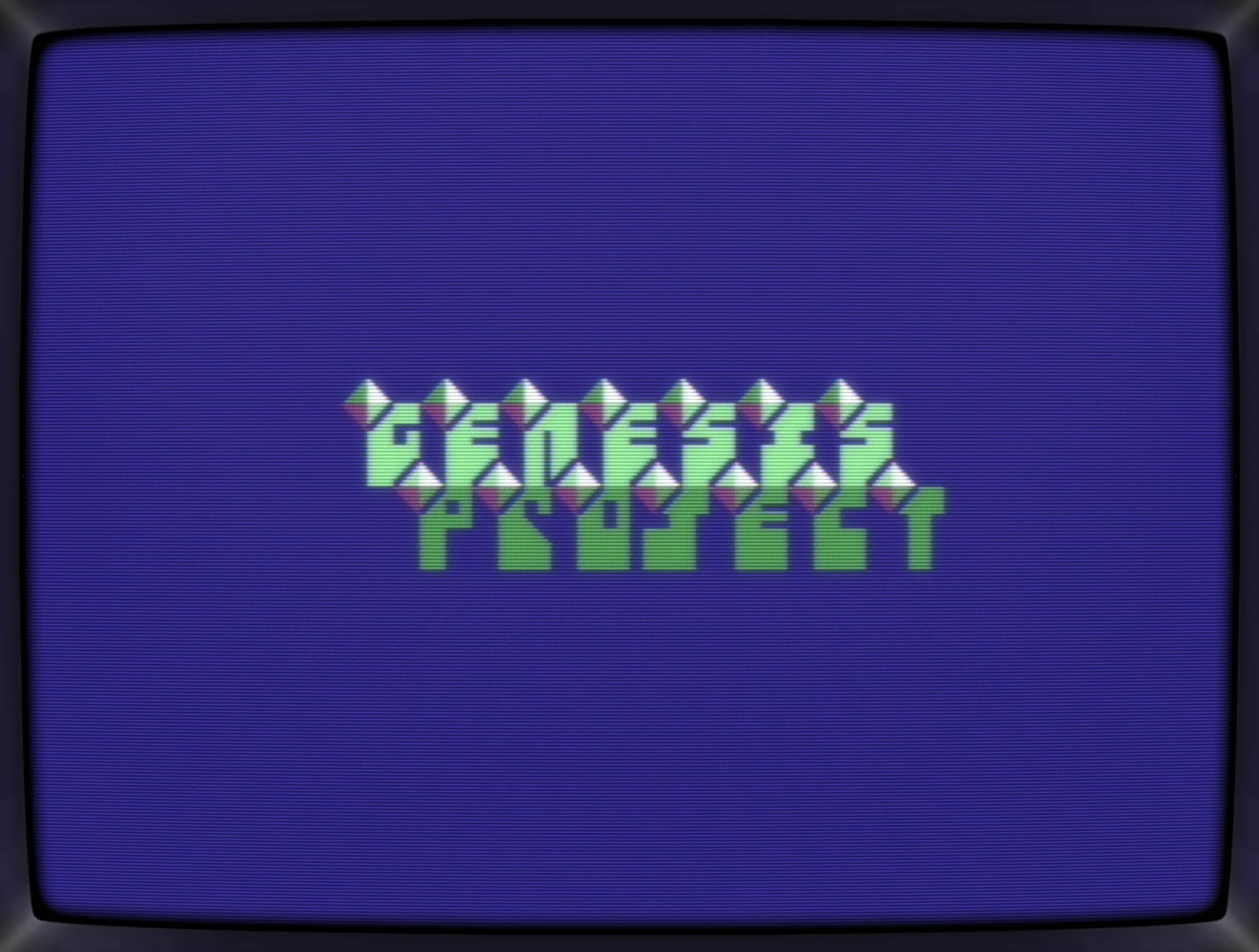
A second variation was also saved within my .pe file: The diamonds have vanished and stripes emerged. Here, the edges aren't cut off anymore but hidden which makes the font sticking out of the stripes. Way better, but the bottom part didn't look done and thus, still no chance of becoming an entry for the compo.

In the end, I had filled up my six entries anyway and the G*P logo got left on the cutting room floor.
Revisited
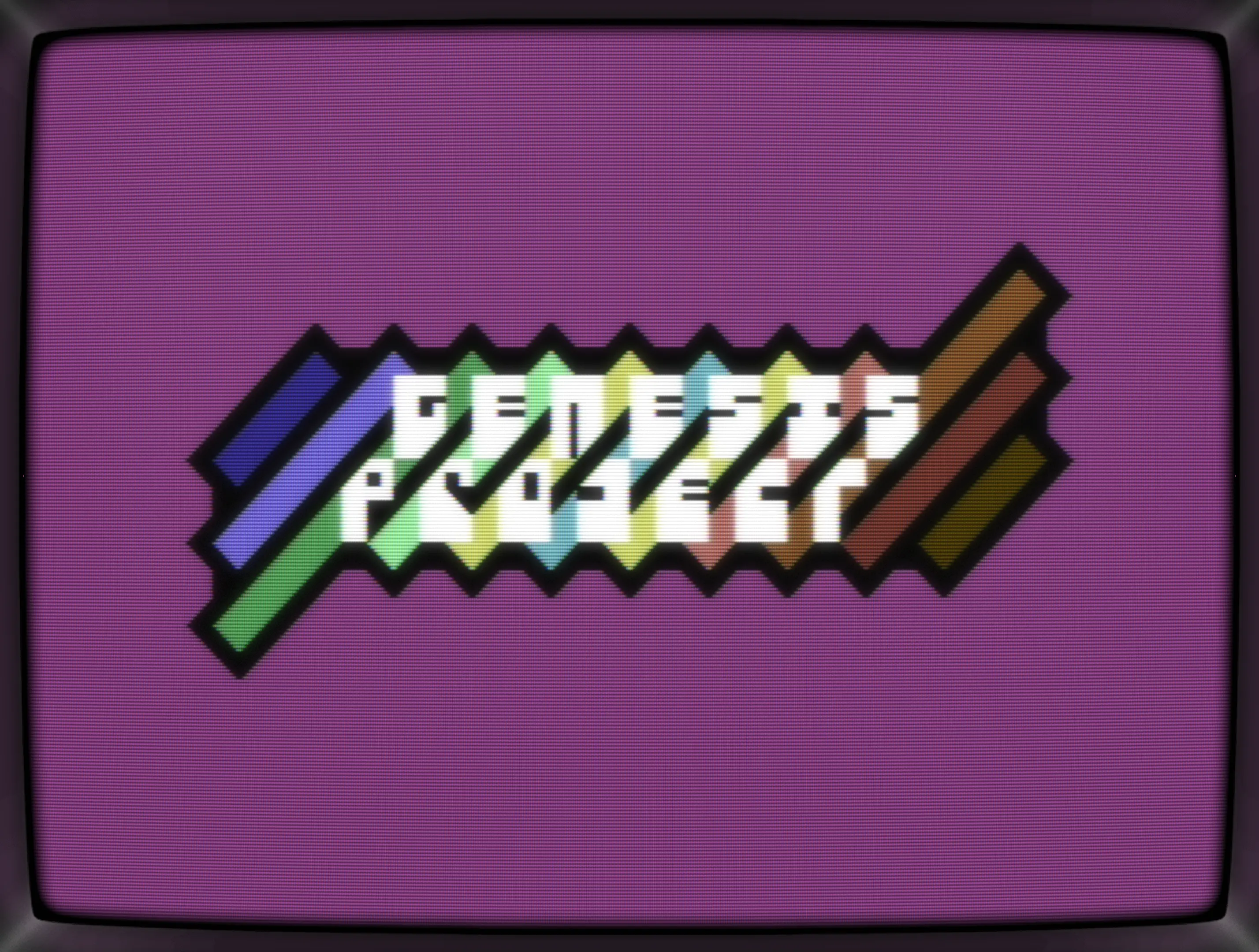
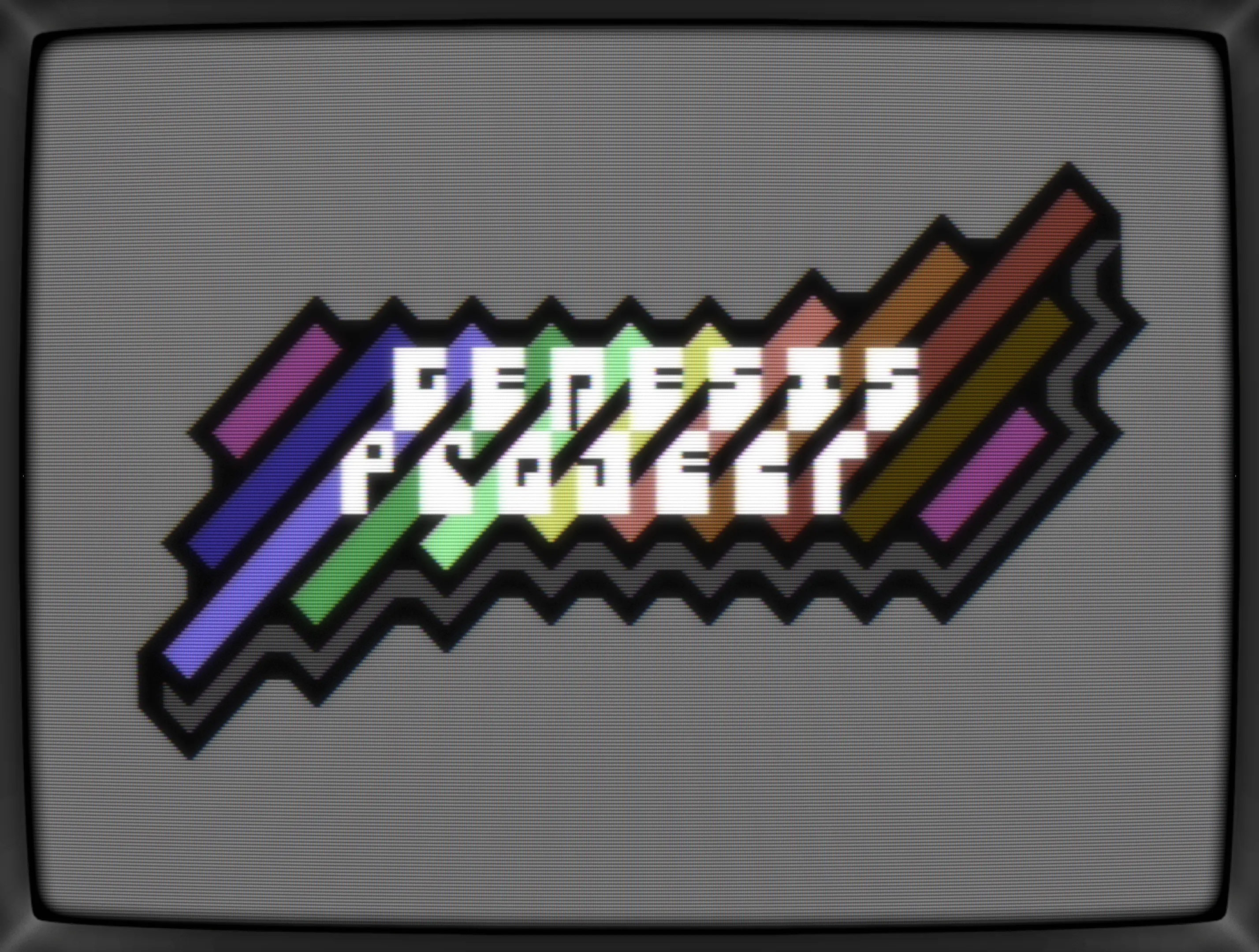
As mentioned, I started to share my work-in-progress stuff with F4CG and thus the G*P logo was loaded up once again and guess what, the light blue stripes in the background still worked so I've sat down and started tweaking with my main goal being to fix the stipes for the second line.
Here's what I've ended up with:
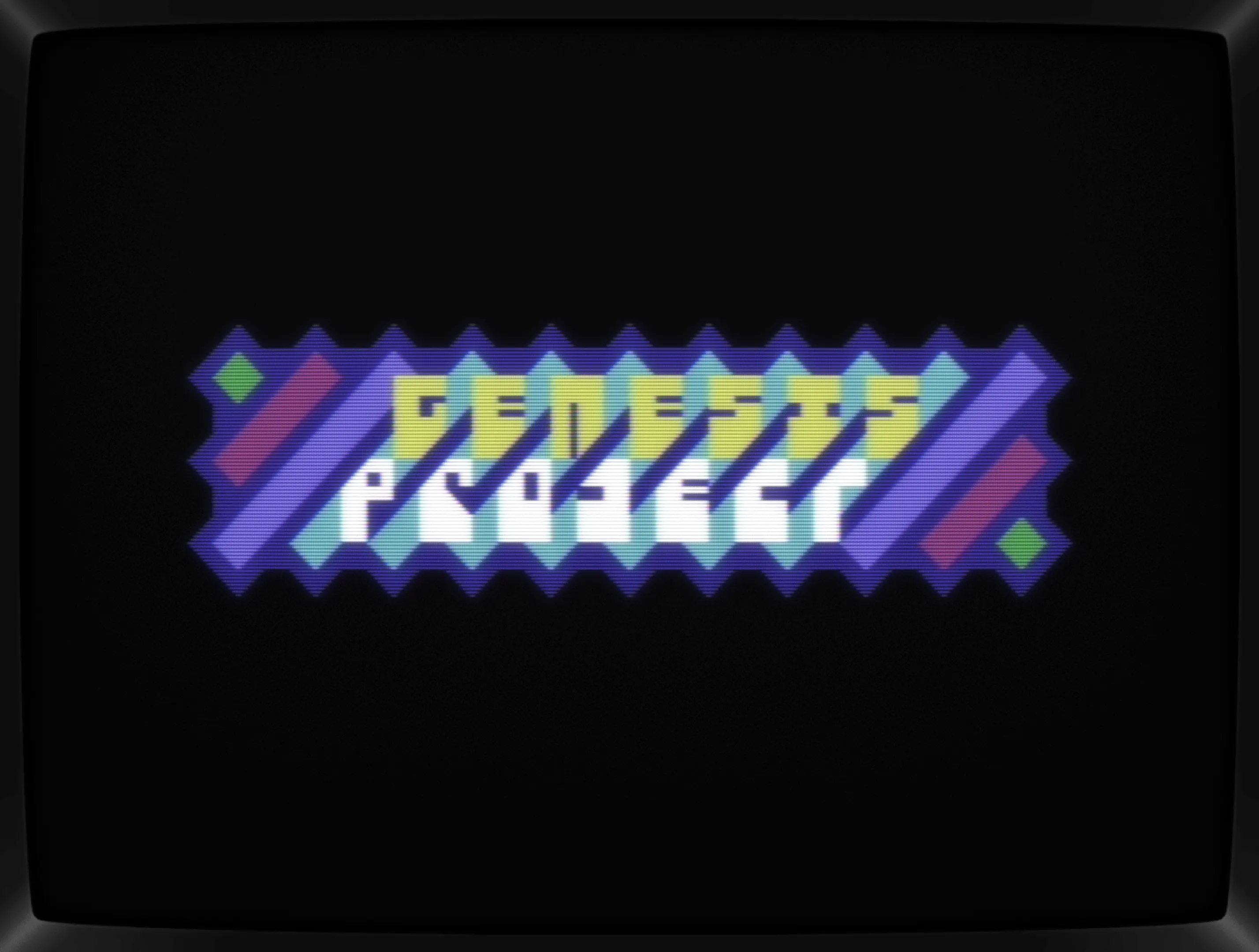
While the edges are all sharp, straight lines, it feels like it's smoothed out when having the font in focus. Neat, huh?
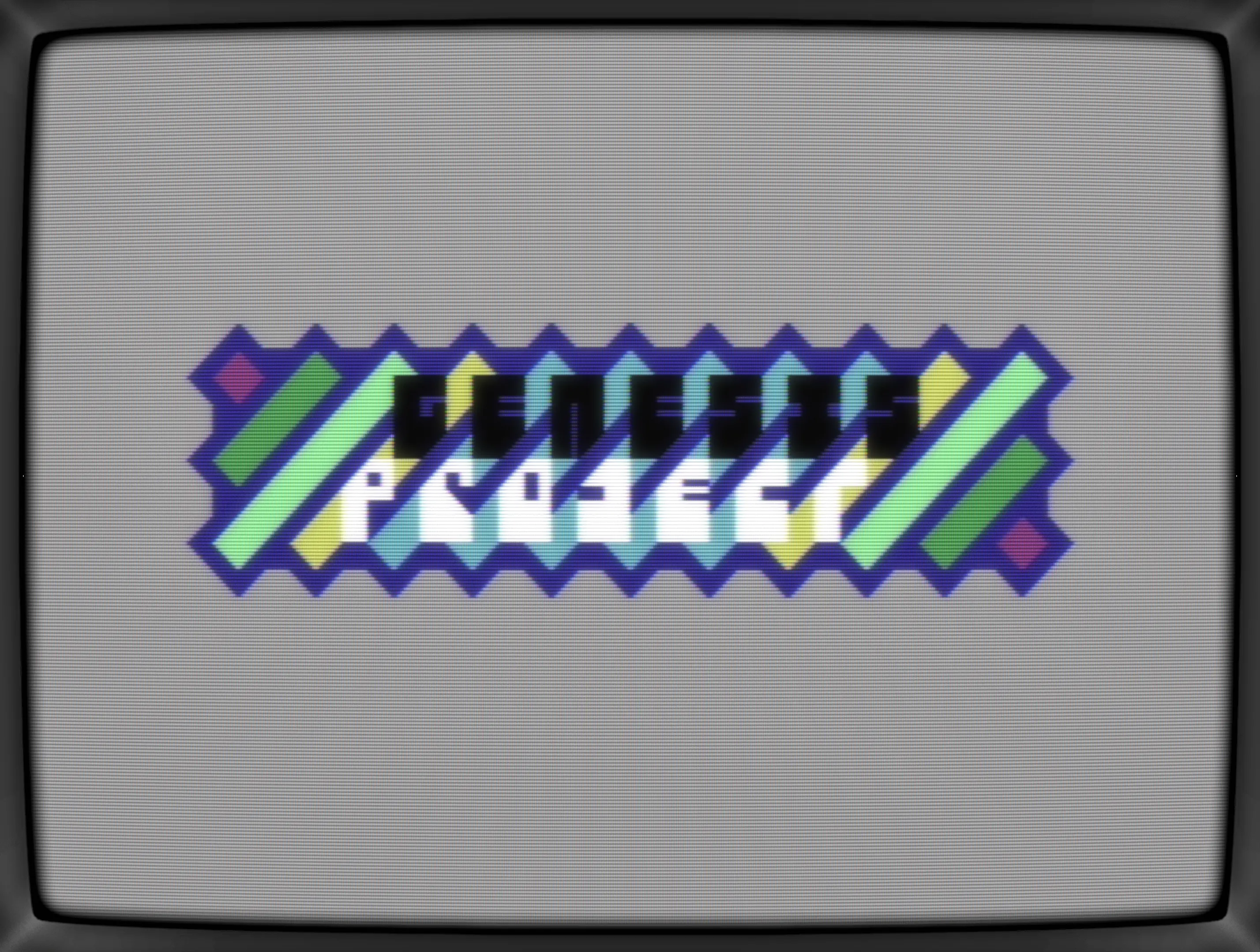
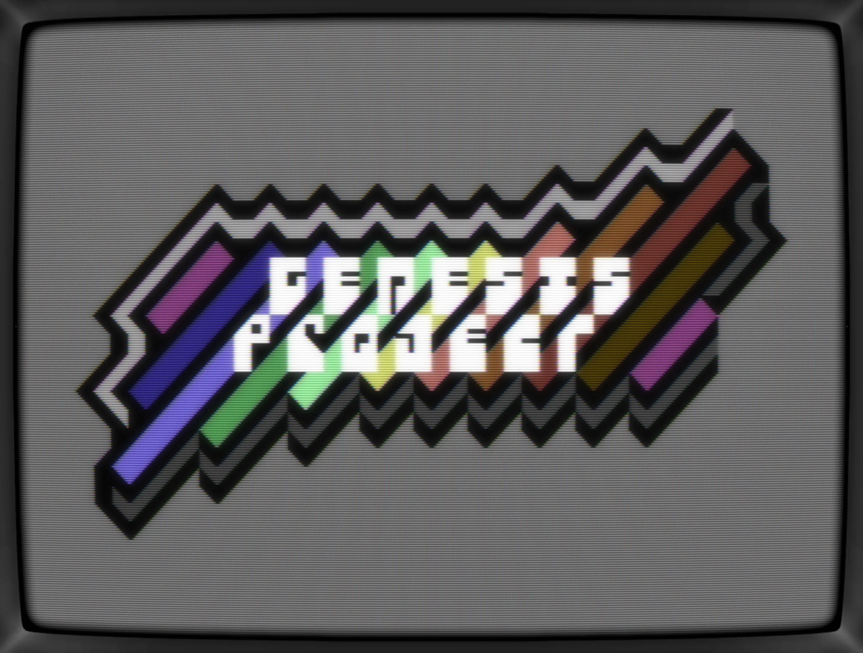
Black background often help making a logo or GFX pop, but it's boring, so I've cycled through various colors and endet up with a light grey one. Colors of the text also changed and at that point in time, I haven't decided if it should be a single or two colors. Again, the following pix is just a snapshot.
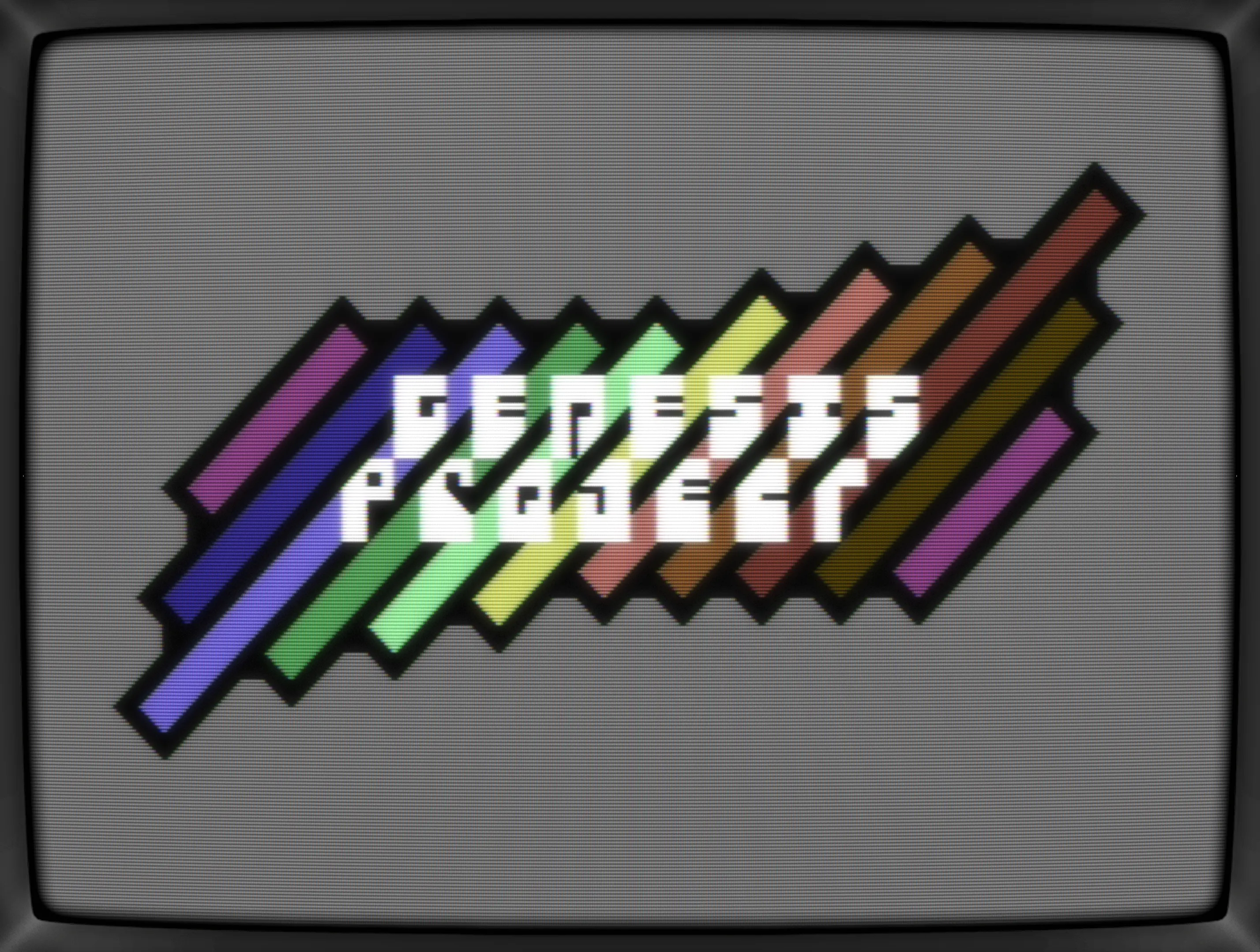
Next up: tweaking the overall shape of the logo by extending and later removing stripes.
Now that's a variant which flowes with the unfocused bendiness of the outline.
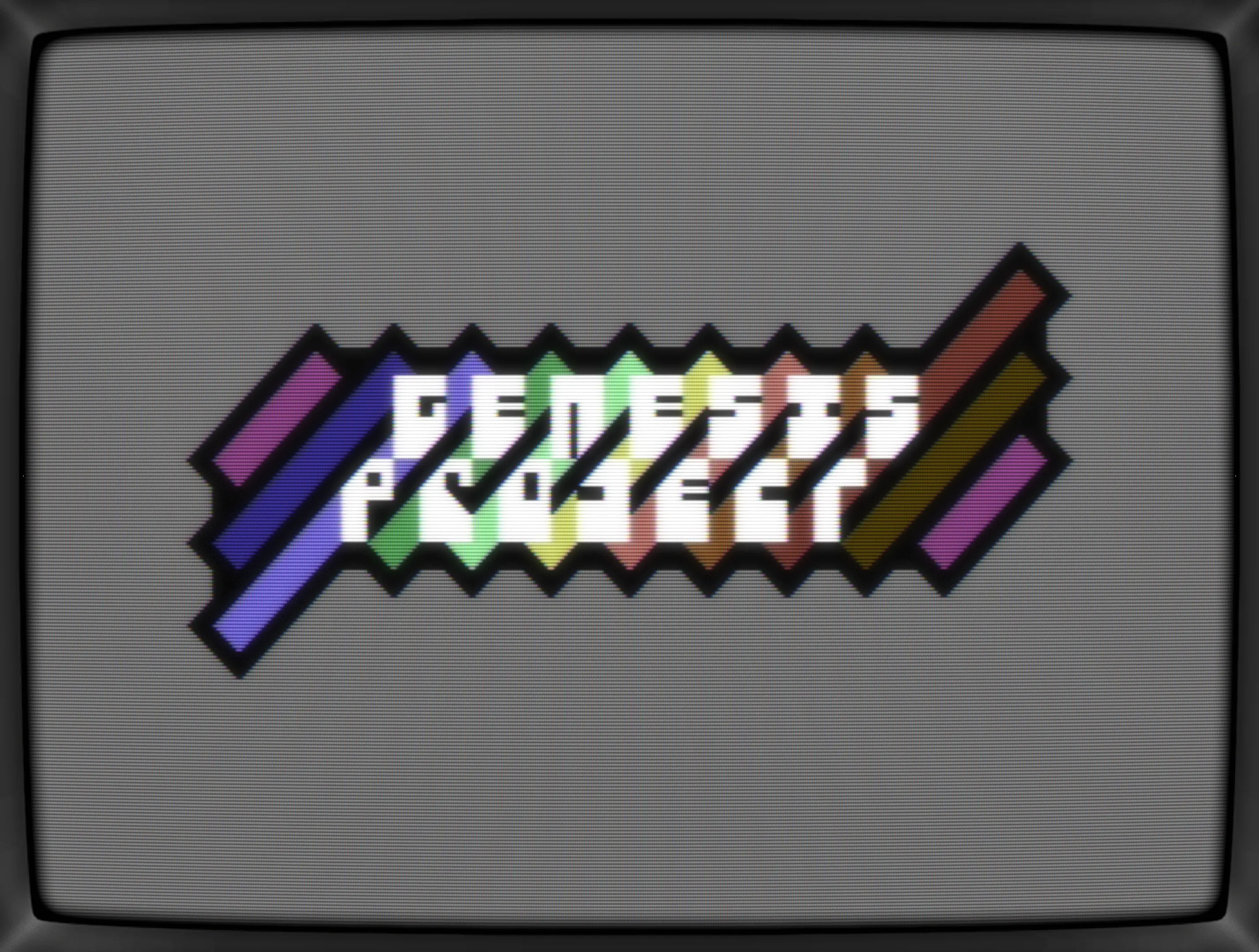
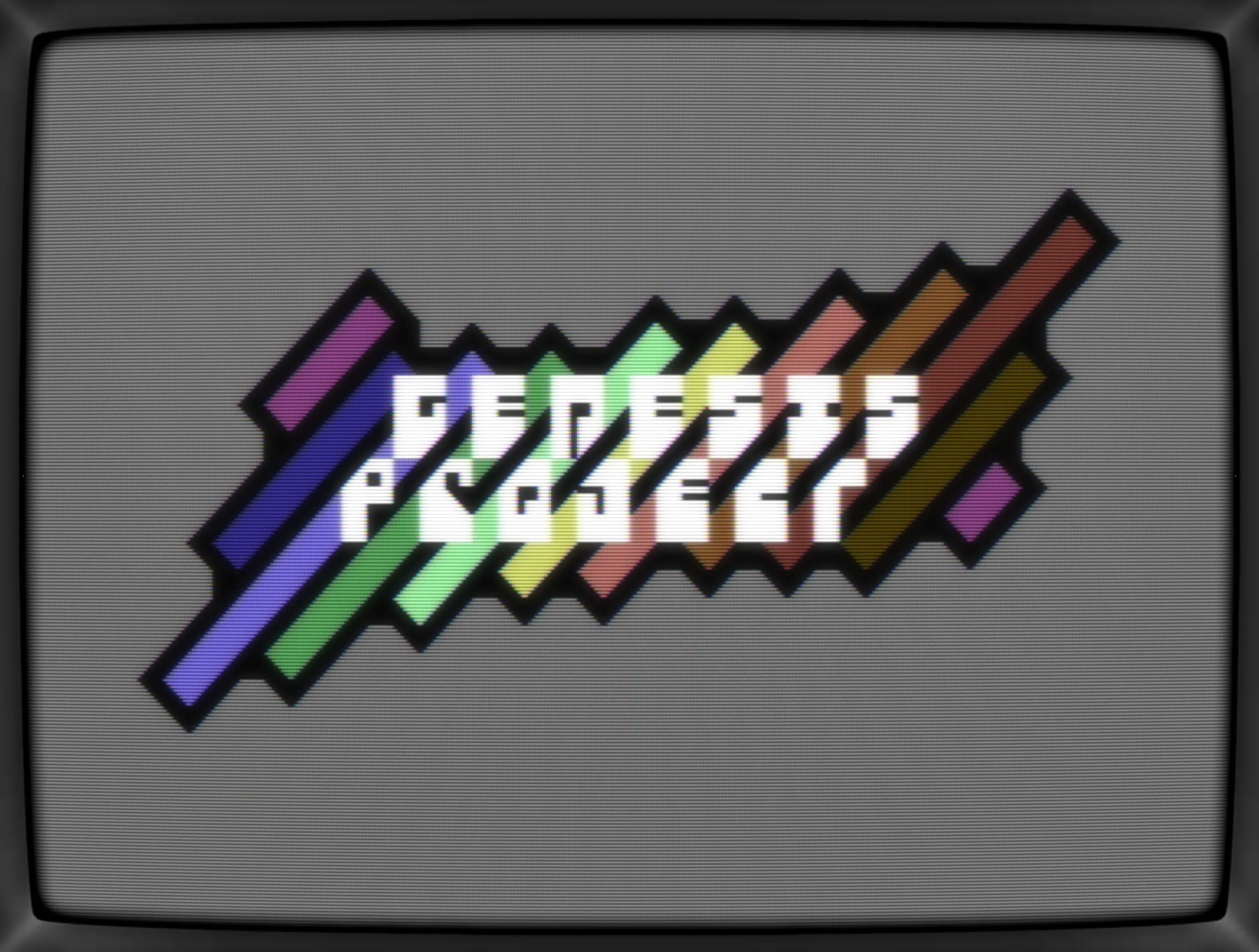
Another round of color tweaks led to a) a black outline, b) a quick'n dirty color gradient (minus purple) and c) font in bright white and d) and the unused purple as background.
Look at that poppin' logo!
A couple of more iterations resulted in a looping color gradient and the background turned back into grey for not fighting for attention with the logo. Still popping.
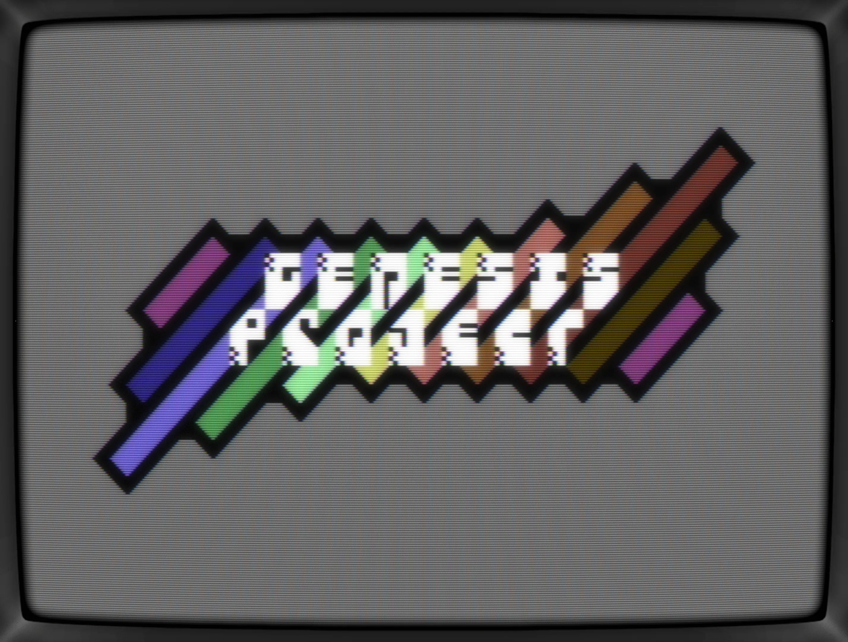
OK, the next one isn't really a step but me trying to add details that aren't really needed. I just wanted to try if the font could be enhanced with some texturing and, well, nope, that's not working. Not at all.
Eagle-eyed readers will also have spot tiny tweaks of the font as well. Here's me trying to balance out differing thickness of the lines and quater-pixels used. In the end, it looks a lot messier than before, but that's an issue of another day.

Anyway, back to the rainbow stripes.
The next couple of stages were done in a quick session, just fooling around and getting variants done, hence the limited descriptions.

How about giving the logo some depth?
Nope.
Nope again.
How about more room for the text?
Ugh, definitely nope.
Irregular stripes maybe?
More lines?

Oh, not it reminds me of a bone from a cartoon, so let's get rid of that by, well, how about adding even more lines. Ha!
Nah, let's go back to no lines but keep the additional stipes.
Wait, new idea! Let's add those lines back in again but this time make them pointy?

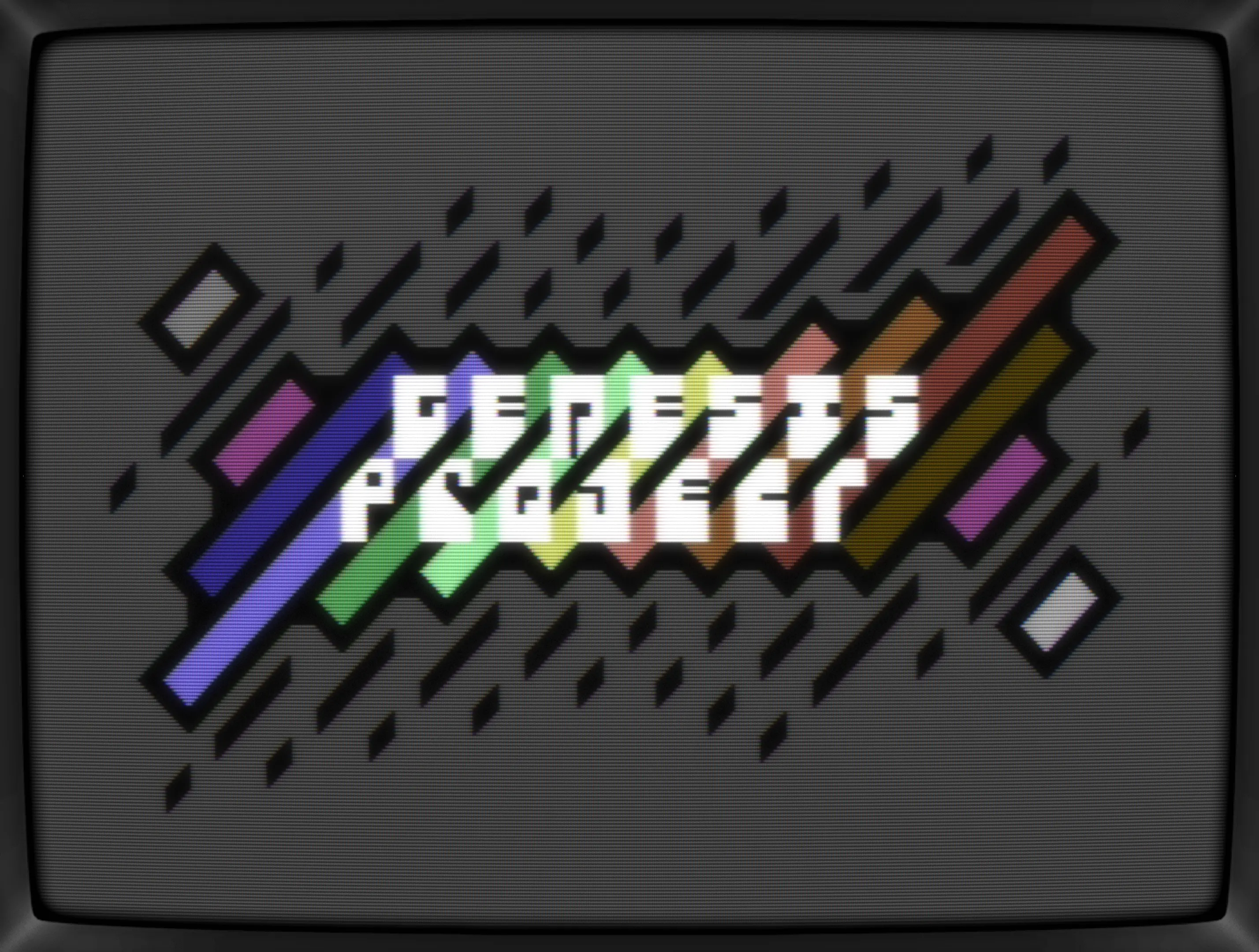
Yeah, there's something in there! A small push for adding more chaos...

Ah,... no. Too busy and the logo doesn't pop anymore, but I will definitely revisite those lines again someday.
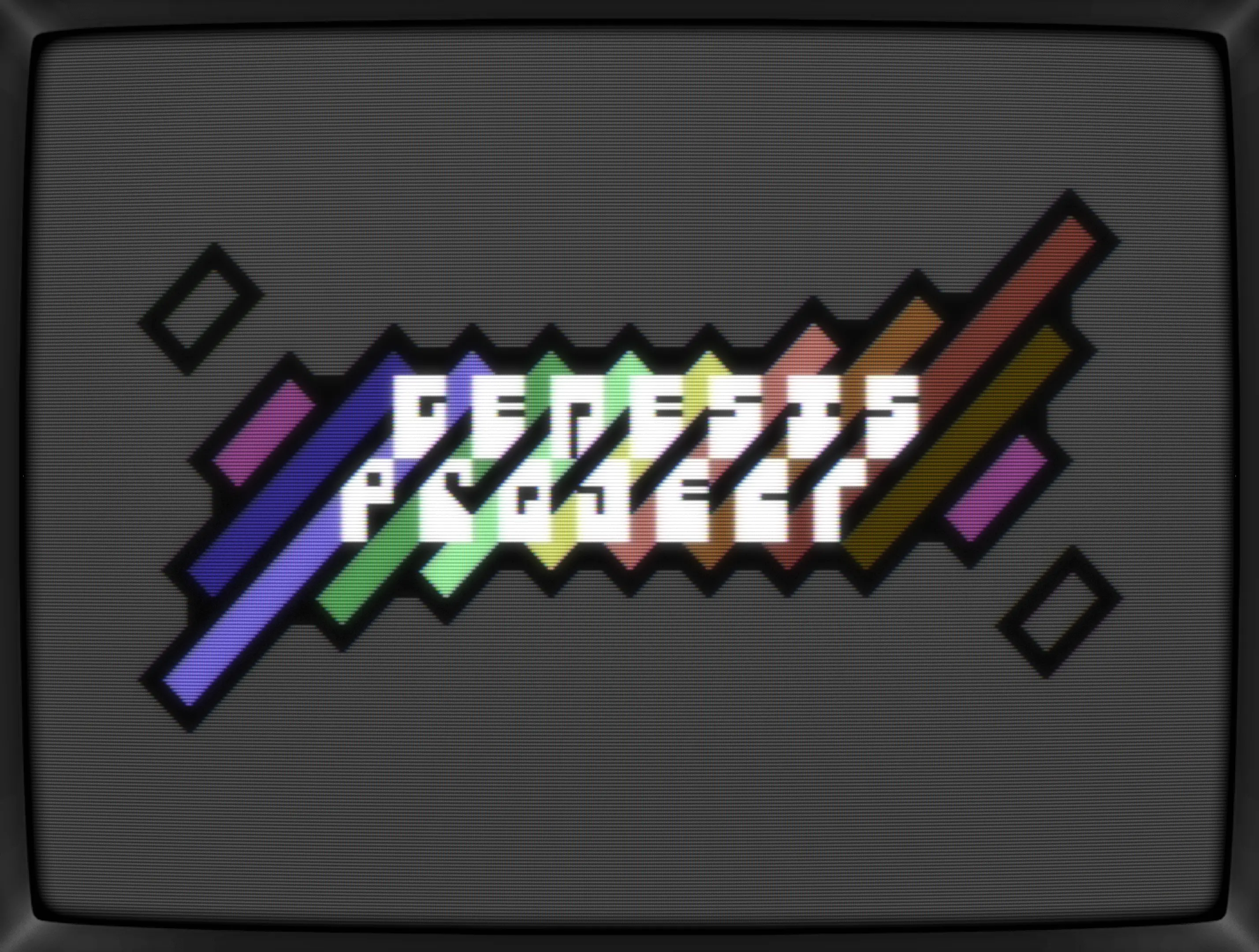
Let's go back a couple of steps and focus.
OK, lines are out, but how about the chaos? Shifting the stripes...
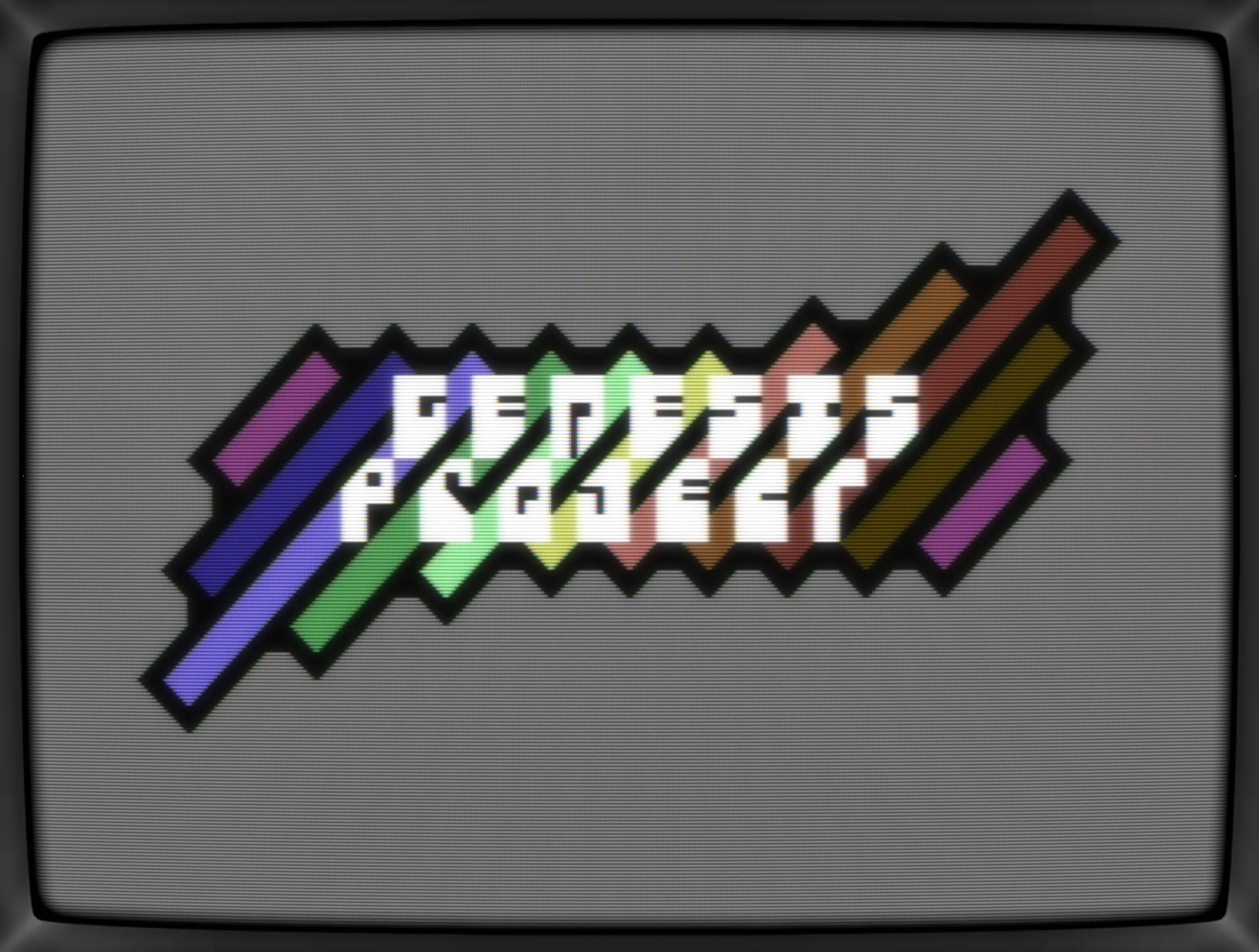
Also, a final tweak of the font, kicking out all thicker lines and holes and going for the standard 2px wide ones. Don't really like the "R" but the rest feels proper polished.
At this point, a quick de-tour back to a lines-variant to see how the new font would fit in.
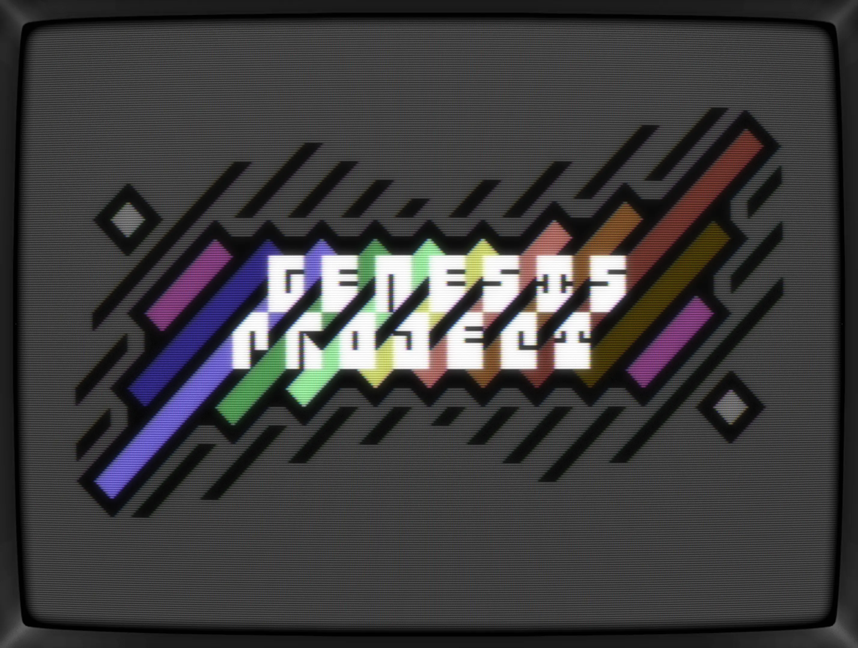
Uh, that's quite something but still busy which it doesn't need to be. Also, the lines only work with a darker background color which should make the colors pop more but it somehow doesn't. Took me a few seconds to realize that the lines are killing the outline and with that messes up the overall contrast of the elements.
As said before, I'm gonna return to those lines someday, but right now, there's no way keeping them.
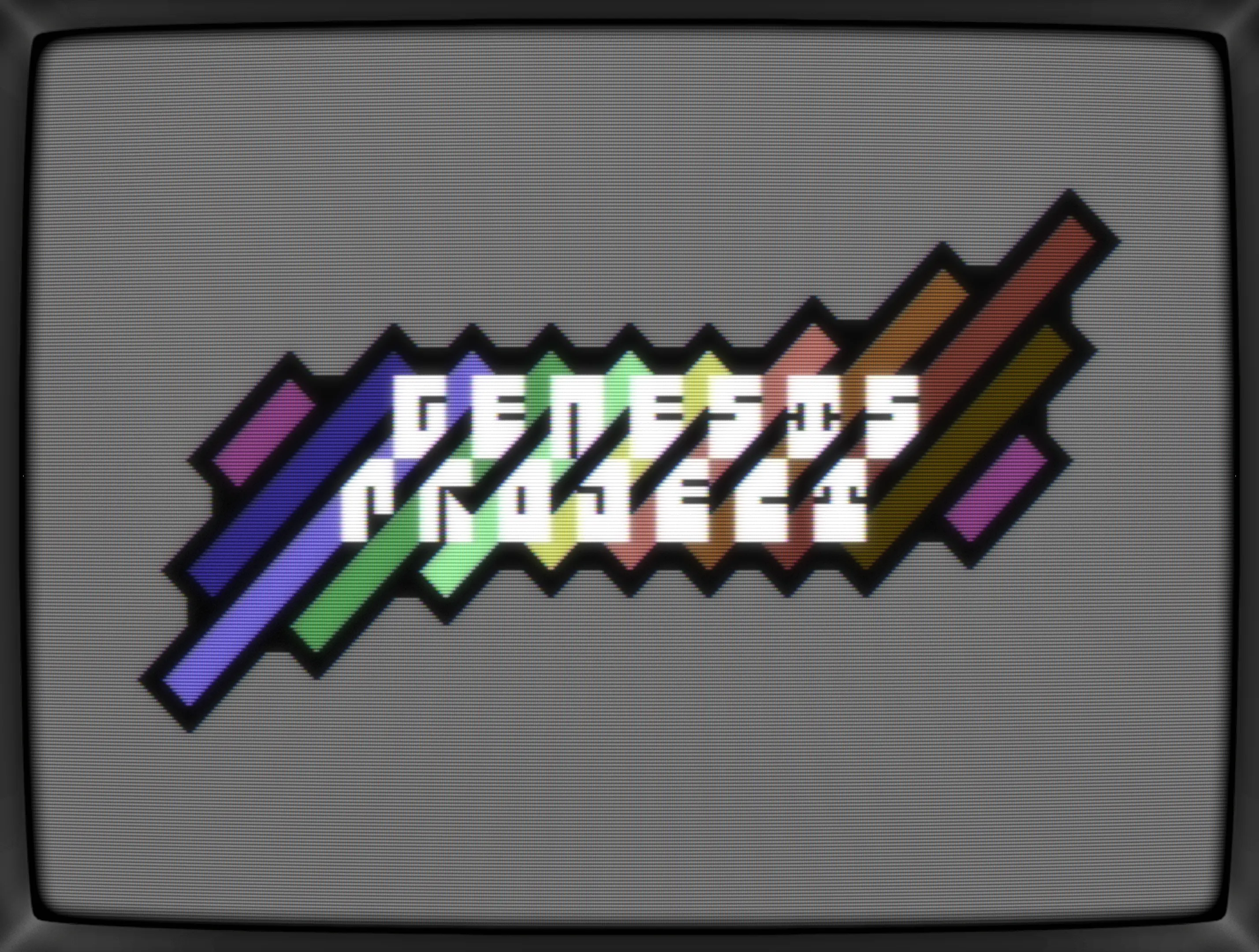
Bringing it all together
Lines are gone, but I do like the extended color bars at the end though and the two added dot are allowed to stay too. The shape transformed a bit throughout the journey and I'm happy to have tried out so many variations. Without that, I wouldn't have ended up with this half rectangular, half bendy - almost streched - form.
Conclusion
It's the first that I've revisited an unfinished doodle after a months long pause and I think it payed off. The extended experimentation with its shape and surrounding details had been fun too and thanks to working in PETSCII, it was just a coulpe of chars that had to be shifted/edited each time which really helped getting into the flow.
In the end, the final logo isn't so different than the first iteration of the initial concept, but all those tiny details added/changed wouldn't have happend without all those tweaks along the way. Last but not least, those tweaks sparked a handful of new starting points for other pictures, that I hopefully will follow up on soon.
Post release notes
Edit 1: Guess what, Spider-J fell in love with the logo and turned it into an intro with color-cyceling, scroller, music and all. Love it!
Edit 2: Oh boy, the day keeps getting better and better! G*P picked up Spider-J's intro and used it for their release of Jump +3D which means, my tiny logo went full circle. Thanks, folks!
Here's a video of Spider J's intro:
What's CSDb thinking about it
(17.07.2024)
Really fab!! :)
(17.07.2024)
This is really awesome! I have some cool ideas for how this could be used (*deleted* the sob story about needing more spare time to code, yada yada).
Really really awesome. Thanks for making this :-)
jmin (17.07.2024)
Thanks for the love, folks!
Added a production note incl a .gif showing the evolution of the logo.
(17.07.2024)
Wow, this is amazing.
(17.07.2024)
Very cool !
(17.07.2024)
awesome! screams for some colorcycle
(17.07.2024)
Very cunning use of the 45 degree black bars to get an "extra" color for the name. Impressive.
(17.07.2024)
Wow! Nice colors :)
(17.07.2024)
Wow! Lovely! Thanx!
Clever use of characters!