MDK
How it started
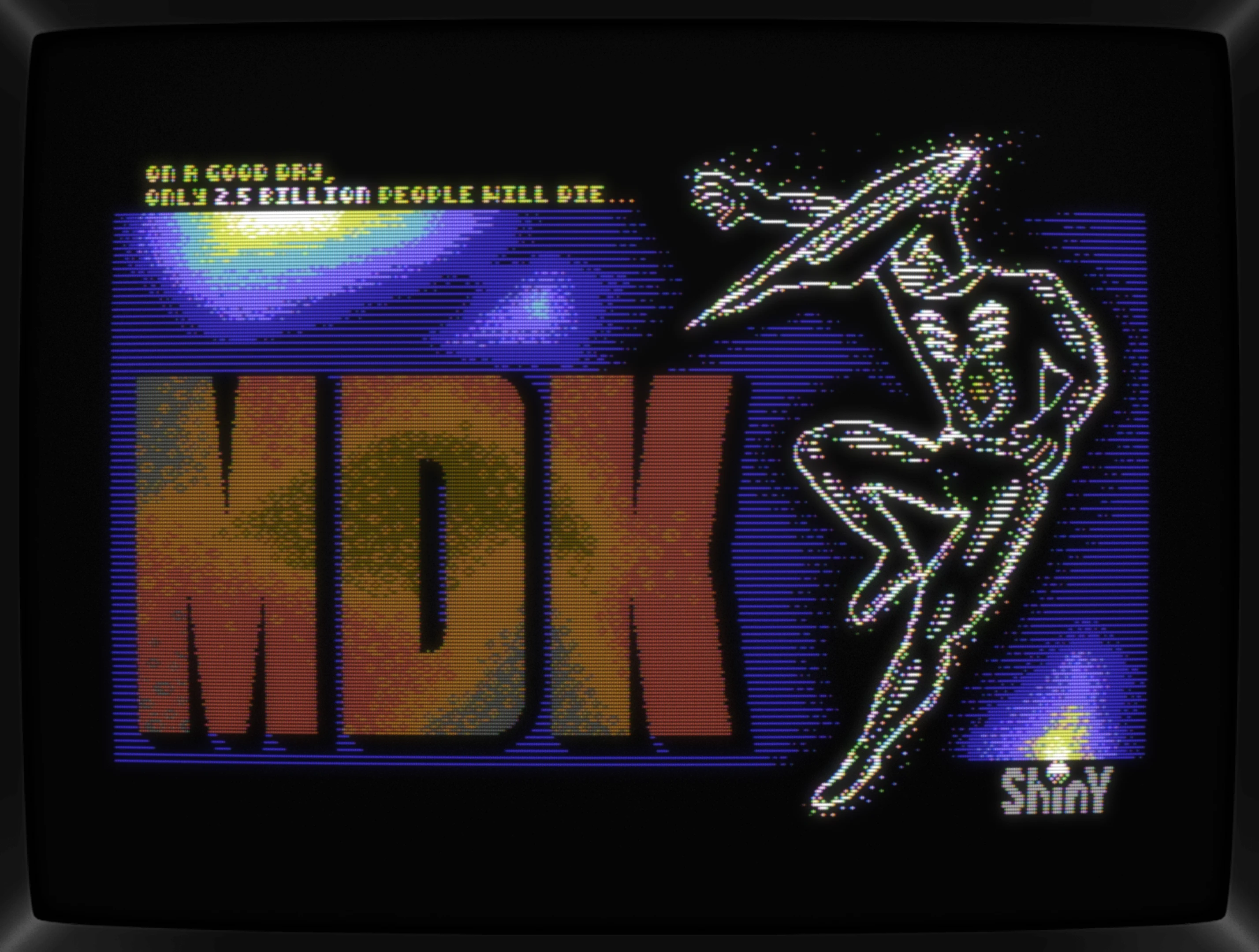
Dipping into other gfx formats than doing PETSCII is something that I am looking forward to and having a compo does help getting motivated. The currently running C64GFX.com Game Loading Screen Compo 2024 made it easy to find a project for practicing. Going for a Hi-Res pic, something not too elaborate was needed and looking over at my shelf full of big box games, MDK came to mind.
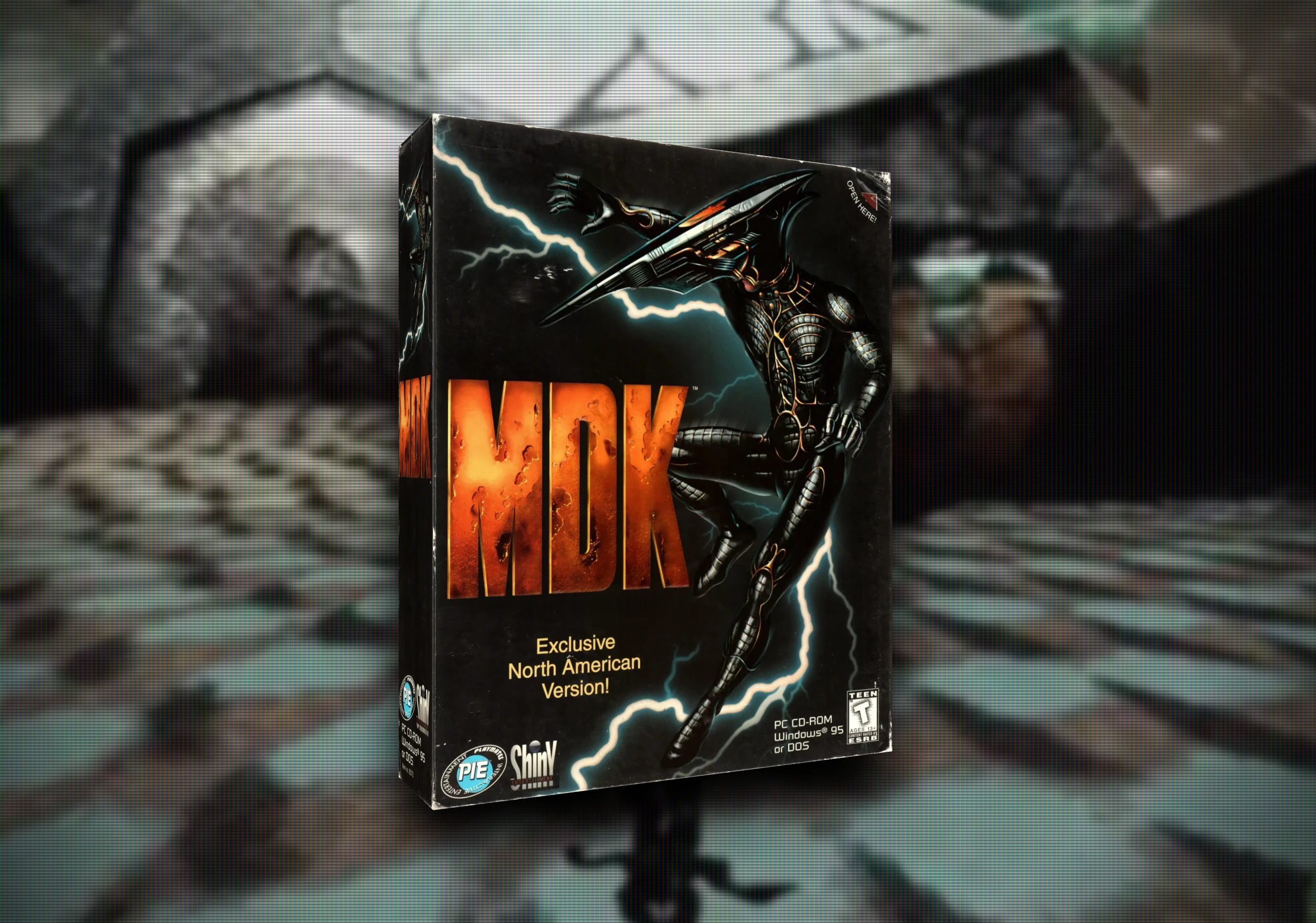
The logo is big with a gritty pattern and Kurt, the game's lead, rocks a highly detailed but single colored full body suit.
This might work, so let's go!
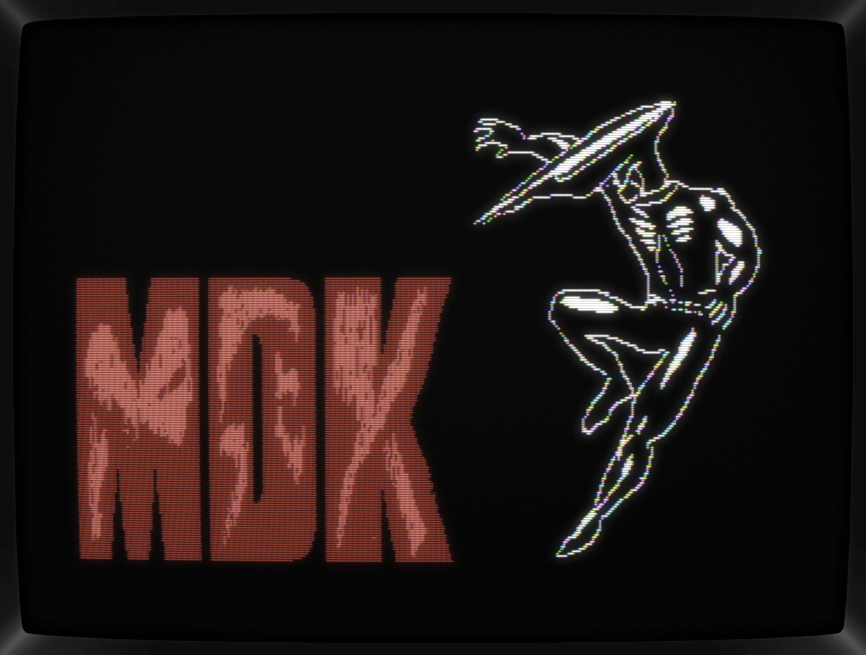
First up, getting the basic shapes done. I'm aiming for both being as big as possible and thus filling up the screen good. Going for a white outline came from Durell's Saboteur, although, I thought I was thinking of the original game. Turned out, its sequel had the protagonist outlined in white though.
For the background, a cold blue would work well for contrast and with the bottom filled up in a quick test, it looked indeed promising and that's sufficient for now.
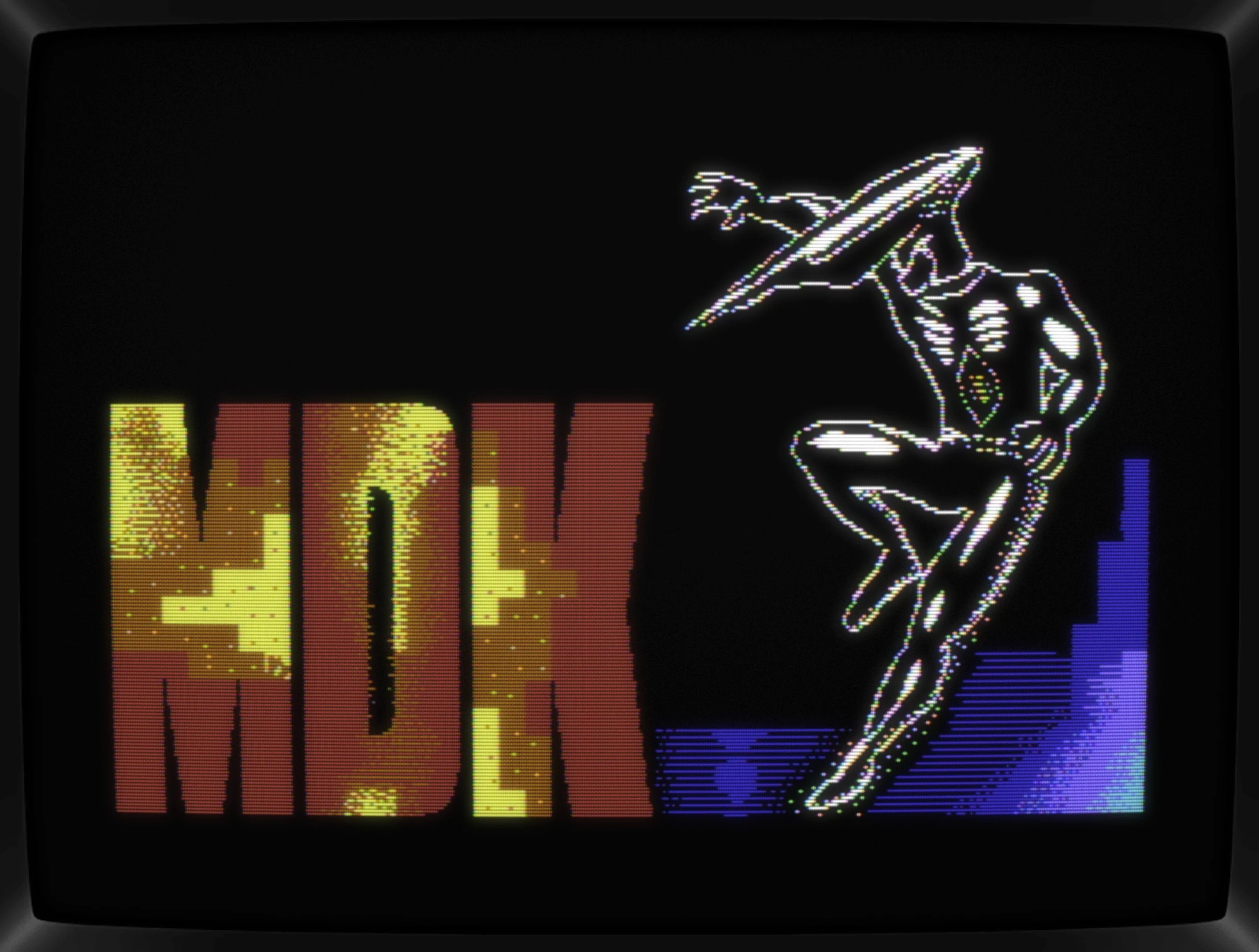
Giving Kurt some more fidelity came easy and turning the MDK into something more colorful too. That's what I've thought, at least. Mixing Red, orangybrown and yellow usually goes well together but it's just too much in this case. The original artwork has a rusty and dirty look to it, especially when looking at the European box art.
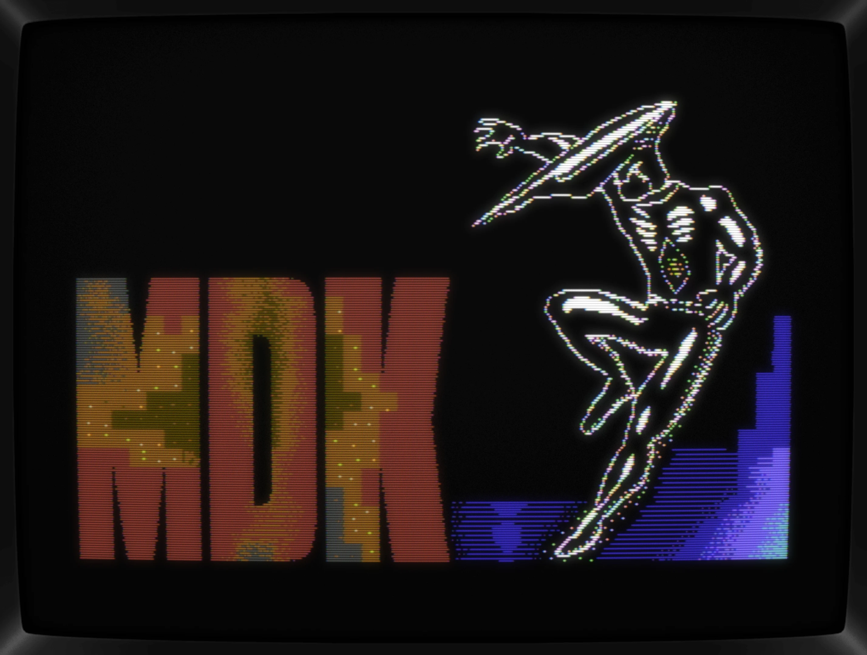
Changing to earthly colors was just a few clicks, so let's start dithering. For that, I took a good look at Sulevi's gorgeous Blowback pic, ignored the stringent patterns and tried my luck with lines that fade out at their ends.
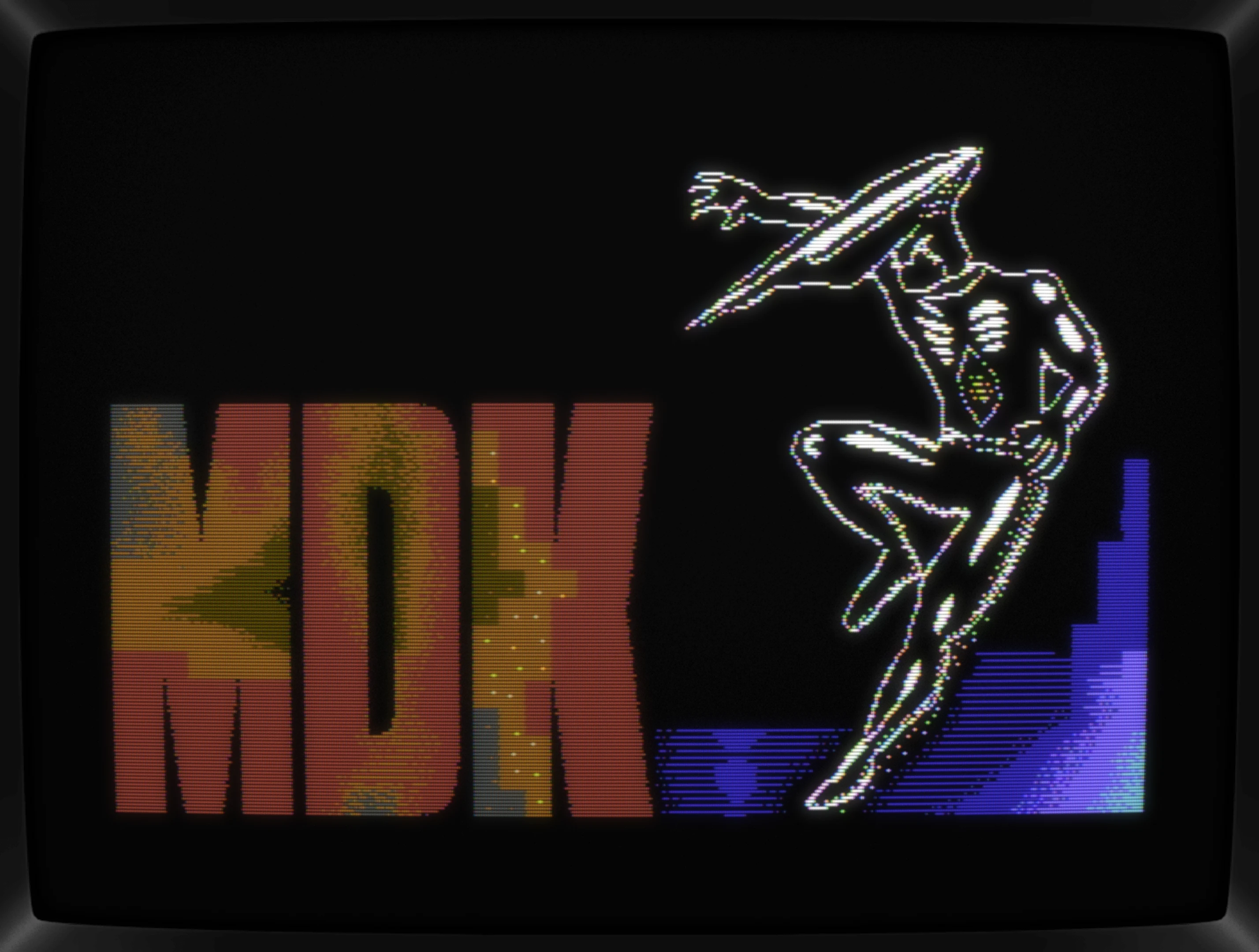
All in all, I've been working on this pic on and off for a few weeks, most of the time only coming back to it for a few minutes tweaking bits here and there due to a "it's just for practice"-mind set. I'm gonna skip those stages here, OK?
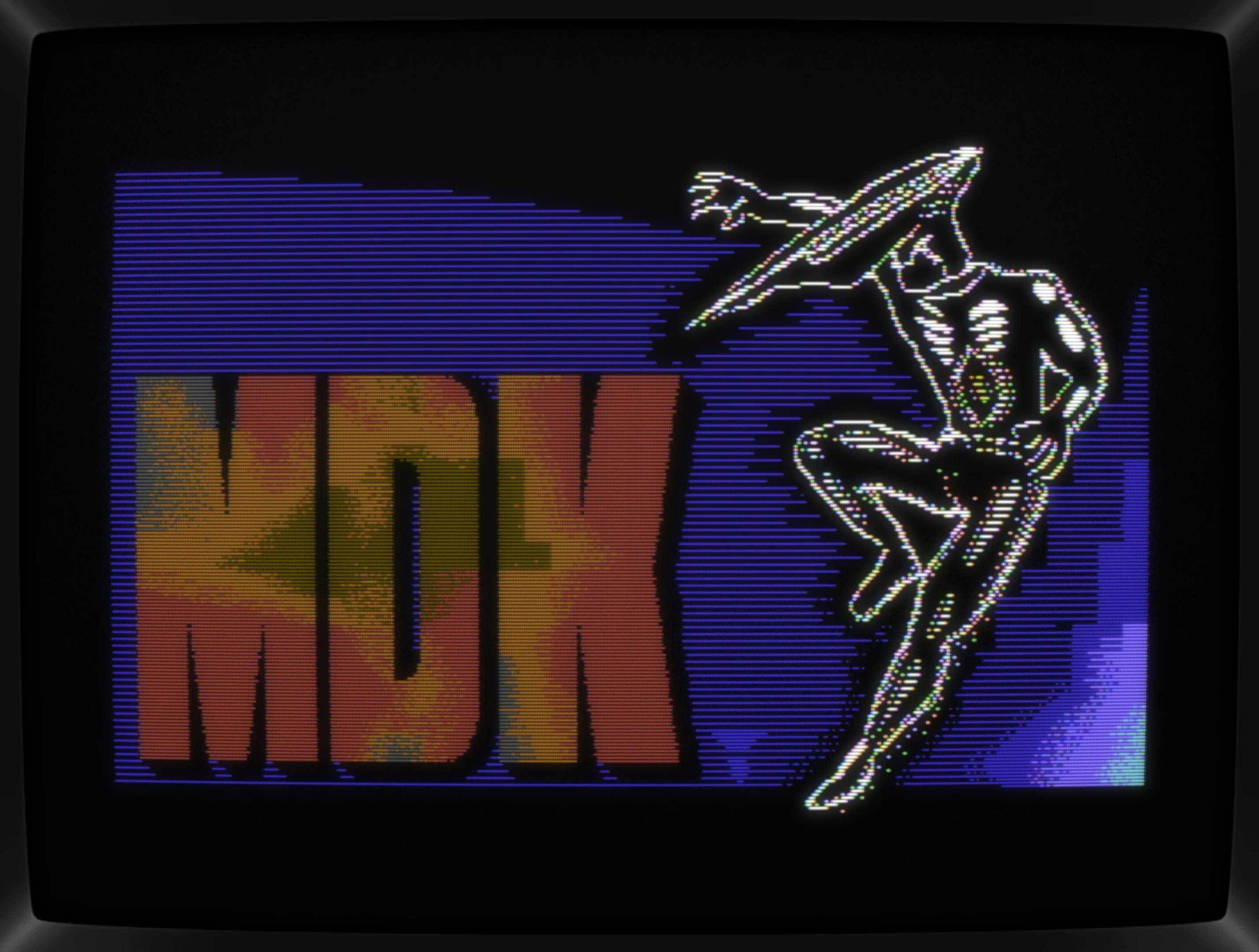
Huh? The pic's now extended into the borders?
Can't remember what I was looking up exactly, but I've stumbled upon over The Chaos Engineer's Raster Effect Editor, which works perfectly with Albert pics due to using the same native format. With that, I just had to try it out and see what a couple of raster bars could add and voilà, MDK's cinematic presentation found its way into my pic with a single click. Fantastic!
To make it fly, a couple of changes are needed but those are definitely improving the not-extended pic too, so that's a yes. In regard to the compo, any gfx trickery is ruled out, so it's just a side mission to this pic. A very cool looking one though, so that's a second yes.
Another thing that changed was deciding against the dithering within the MDK logo done with lines. It wasn't bad looking, but having it in the logo and in the background bugged me, so how about going for circles? While not an exact match with the original artwork, it's closer to its organic texturing and thus worth a try.

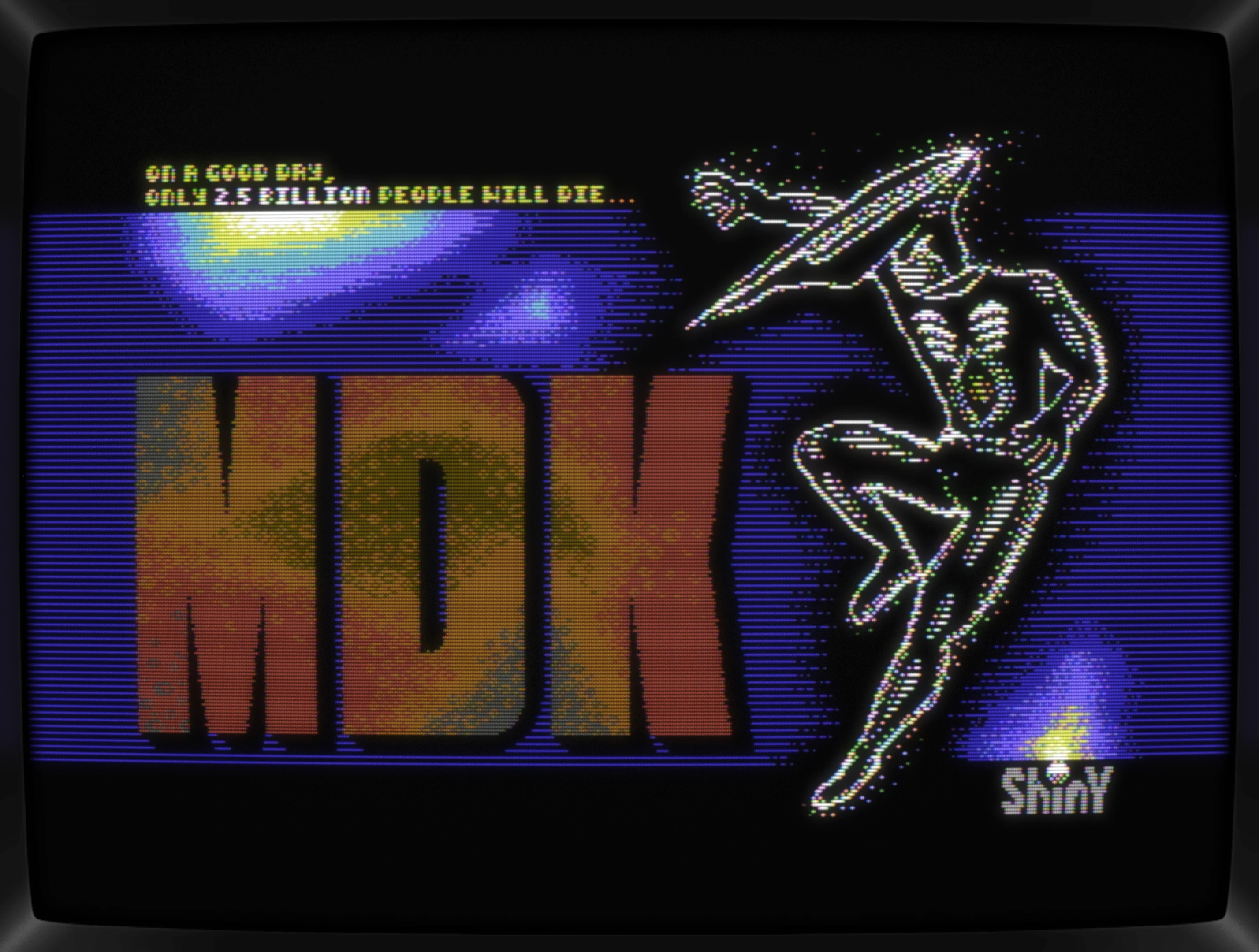
Back to the pic: As we're in for a "Loading pic" compo, things like tag lines and company logos are a must (at least in my eyes), so both are added and guess what, that's a happy accident I've been secretly hoping to happen because up to this, I still had no real clue what to do with the background. Now, with those additional elements, both with a color highlight too, the background could pick up on these.

The pic's shaping up nicely, and submitting it to the compo is go. Better get the dithering done

Done!

For those interested in all of my pixels and errors in details, here's a video created by using Alberts workstages feature. I'm skipping every other frame to cut it down a bit, but it's still all in there, so "enjoy":
Conclusion
Yes, sure, it's not an original "original design" but turning something into 320x200 hi-res pixels is something I do see me doing more often in the future. Dithering is hard, and I'm sure those more skilled than me spotting errors and flaws all over the place, but as labor intensive as this pic was, it still was fun all the way through.
Pretty sure the competition will shed out high-quality pics left and right, leaving Kurt - while shiny white - back in the dark. We'll just have to sit and wait a couple of weeks and enjoy all the submissions popping up :-)
Bonus
Having seen the pic with raster bars almost spoiled it for me, because without them, the Logo and Kurt are just a tad too big. Then again, releasing the extended one as a bonus is all I need to be happy with the overall project, so nothing really lost here.
Post compo notes
Results are in and Kurt made it to the top. Well, at least in the HiRes sub-category \o/
What's CSDb thinking about this production?
congratz!!
Congrats, jmin! Winner of the hi-res category in the compo..! Great pic!
Nice hires! :)
@4gentE Stumbled upon <CSDb release (225613)> and had to give it a try. Had to redo some bits of the pic in order to make it work with the raster bars lines but worth the time as these changes also improved the not-extended pic as well.
Lovely! Used to play that game a lot. Bonus sideborder version pic is much better IMHO.
Hah nice, loved that game.
Thx, folks. #1 in sub-cat, but #18 overall