Neon Ooze
How it started
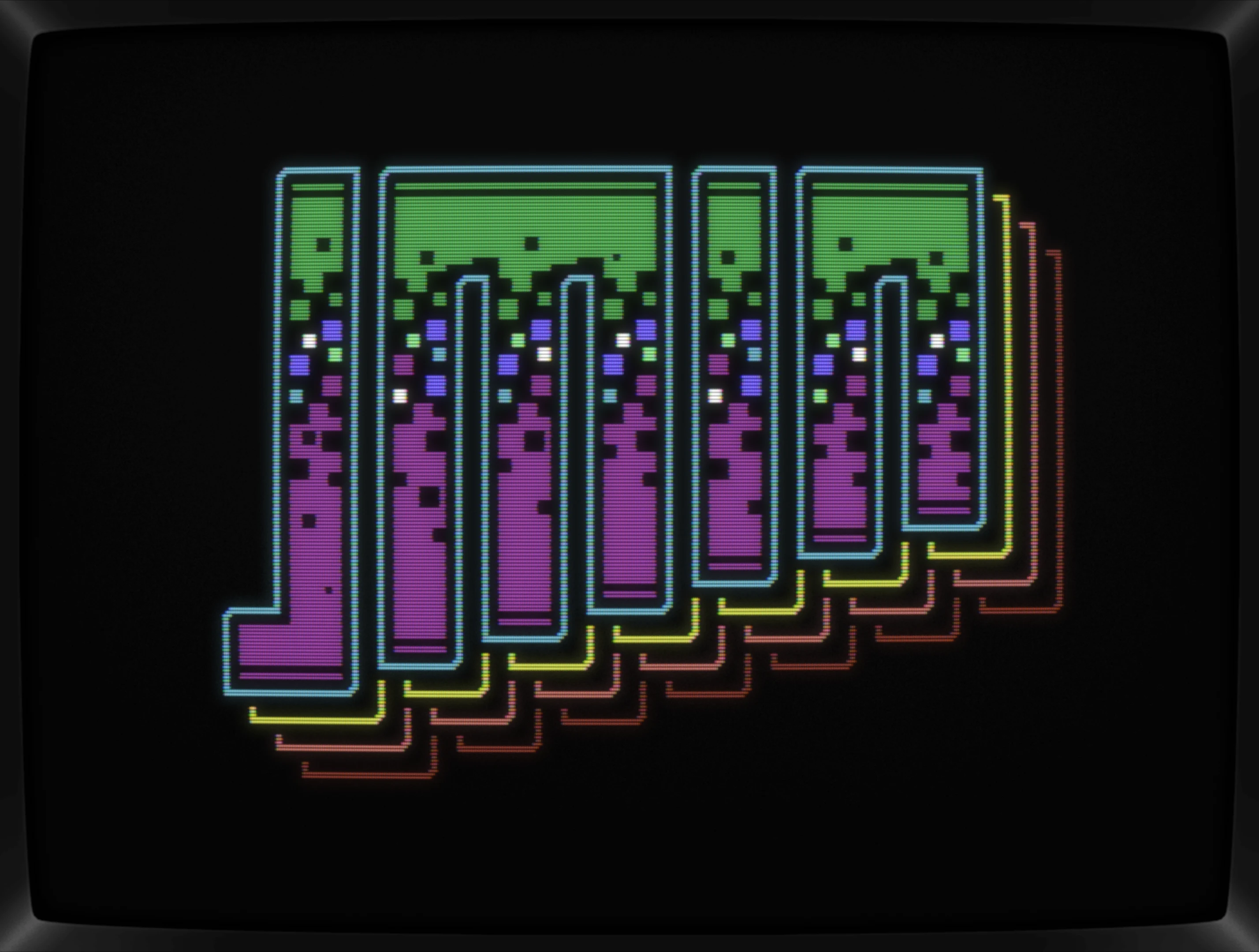
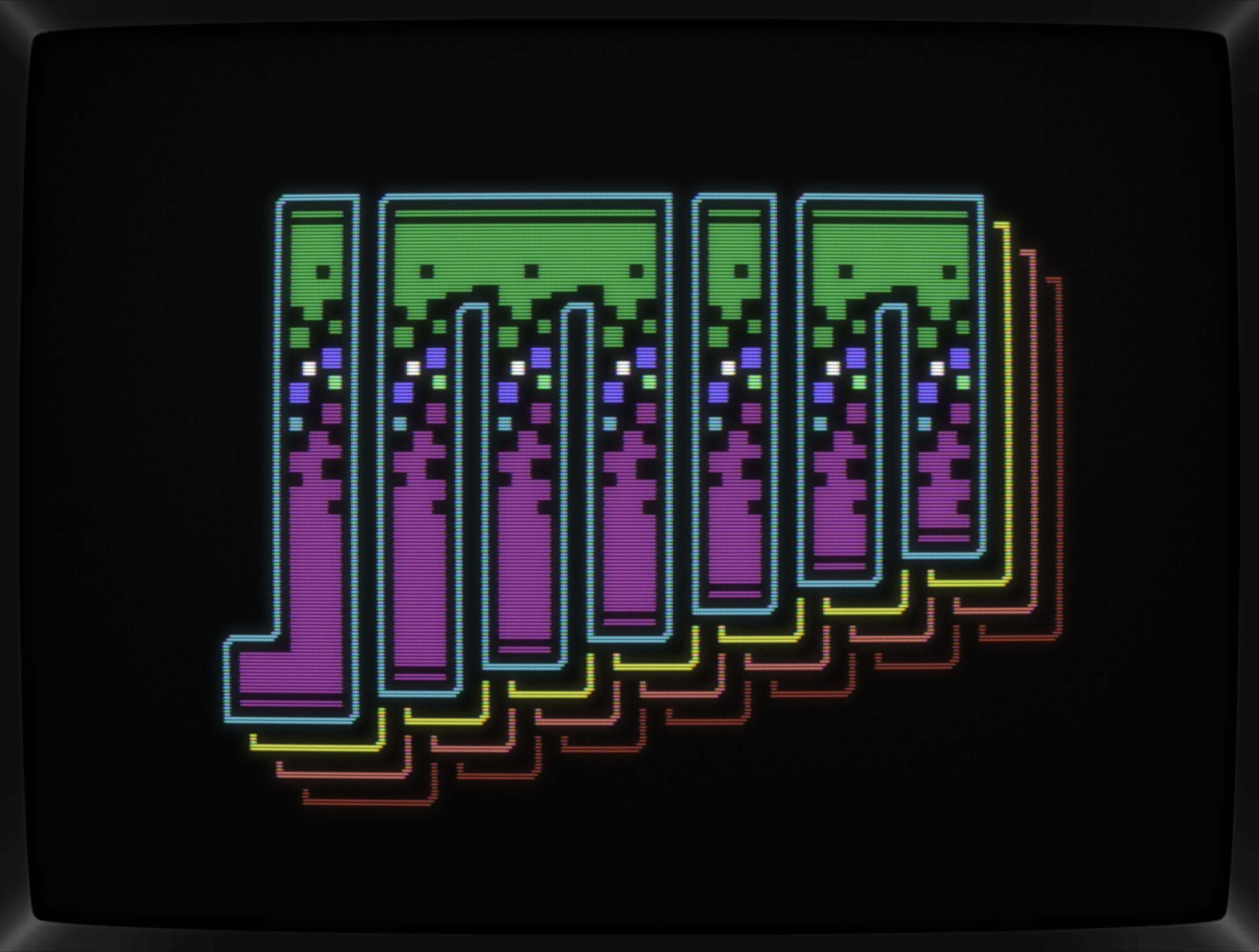
It's a bit of a blur, but this logo should rather be #6-ish than #26. Long story short, it came up a year ago while doing logos for the C64GFX.com CharSet Logo Compo 2024 but it somehow ended up on the cutting floor.
Anyway, while wading through my undone project files, I've rediscovered it and fell in love with it as soon as lit up in micro64. When chosing my handle jmin I've had it in my mind as bunch of parallel lines with varying lenghts and well, that's exactly what Neon Ooze is.
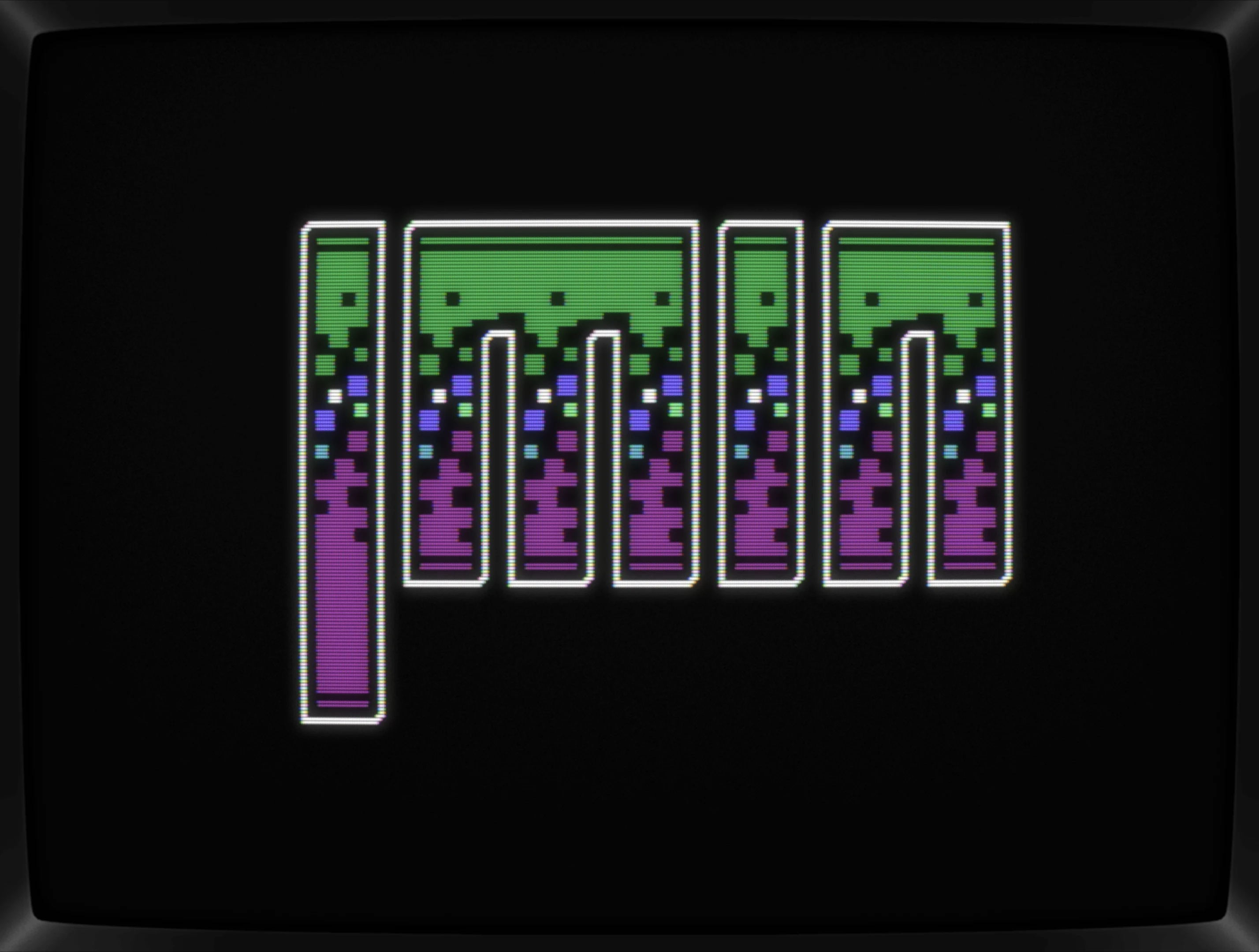
In the .pe file, there's a more advanced version too: same energy but pushing the overall shape and adding a border of sorts.
Not sure why I didn't follow through with that one, maybe I already had my six slots filled, maybe doing another jmin logo felt off, but with some distance to it, I do feel it should't be stuck on my HDD forever.
Before releasing it into the world, I tweaked a coule of squares here and there, minimalistically mixed-up the colors and called it done.
Conclusion
Not much to add here, happy, it connected with me after almost a year hiding in a folder.
What's CSDb thinking about this production?
jmin (22.02.2025)
Thanks, folks
(21.02.2025)
Nice and fresh Jmin! :)
(21.02.2025)
f r e s h !
(21.02.2025)
Oooh, nicely done! Great work, jmin!
(21.02.2025)
Cool !
(21.02.2025)
Nice!
(21.02.2025)
Nice (like) soda dithering:)
It fizzes, it pops.
Nice one!
I had seen an earlier version. Glad you decided to use it.