GP Intro Mockup
How it started
As always, it started with a blank page and with the C64GFX.com CharSet Logo Compo 2025 running, the goal to do a logo.
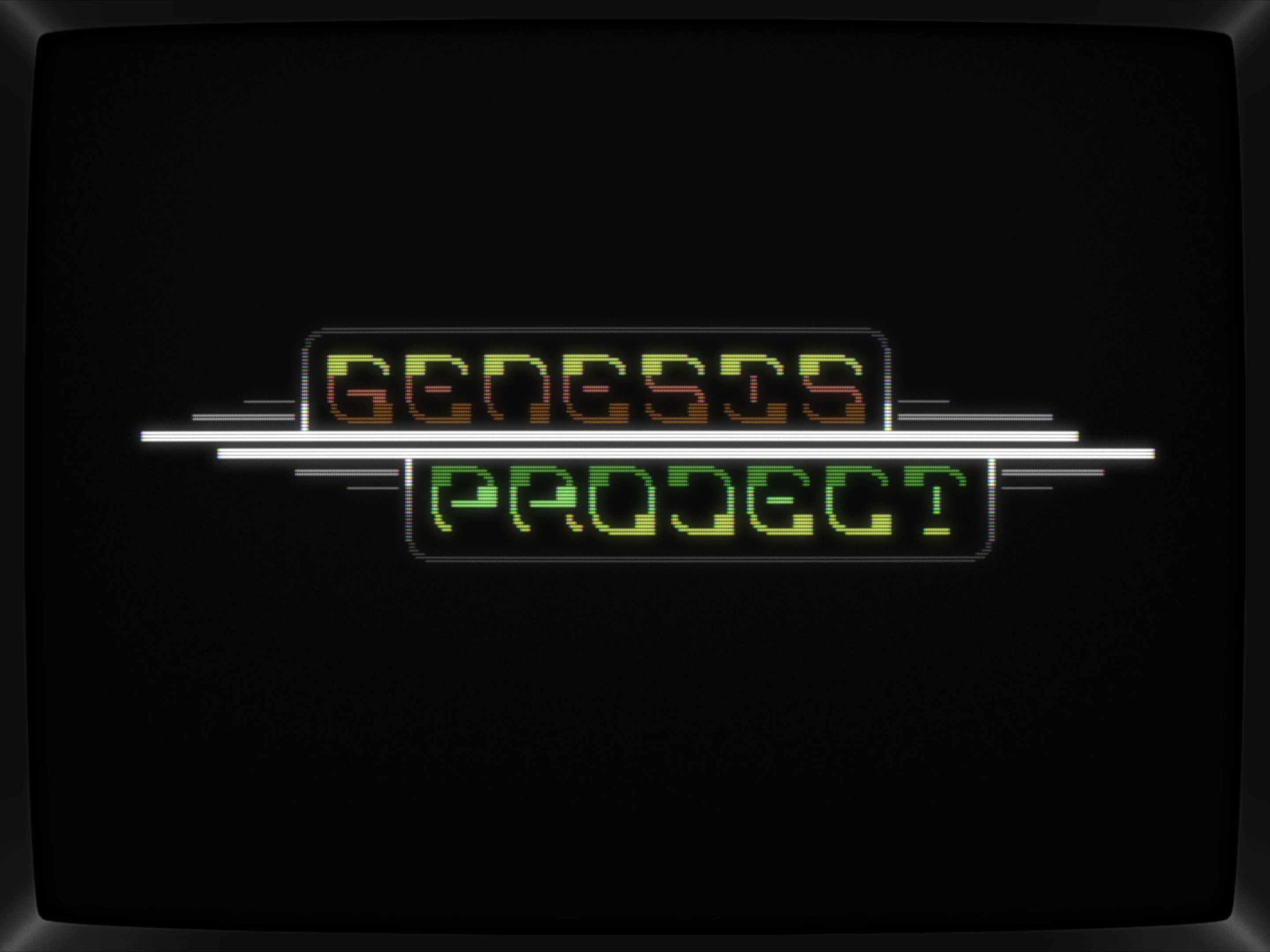
Some minutes of fooling around with a simple 3x3 font that magically worked for all the chars needed, this here showed up

And with that, I thought I'm done already.
It's rather simple but elegant but my doodle session felt too short so I just kept on tweaking.
Next up, different colors and trying to find variants in the font.
Nope, those fonts don't relly work, do they? On top of that, it won't go well with the overall look anymore, so let's keep the boldness centered and the fine lines rounding everything up.
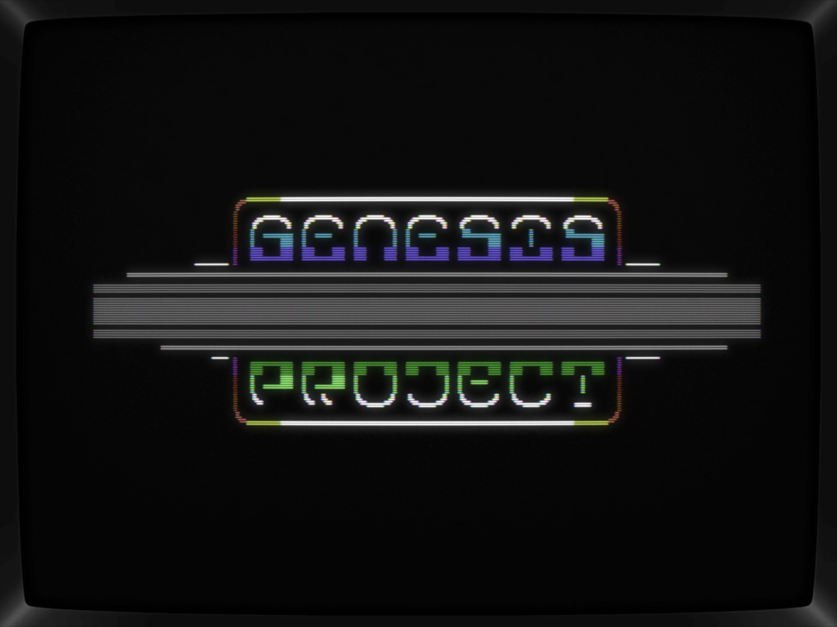
Removed the border to see if an even more stripped down version would resonate and sure, it does get slicker but also nothing that I felt would be able to compete in a compo. It's a tad too simple now.
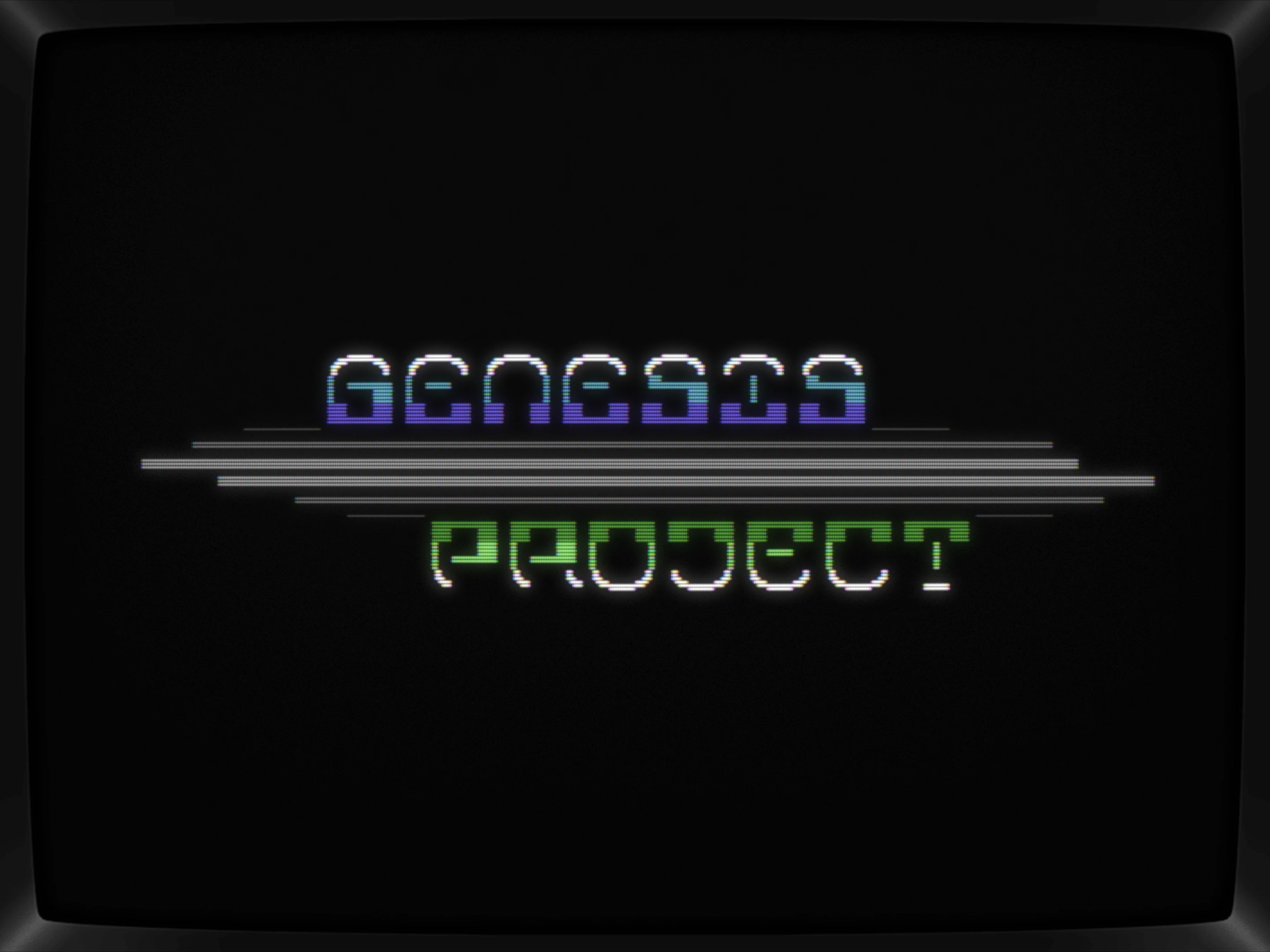
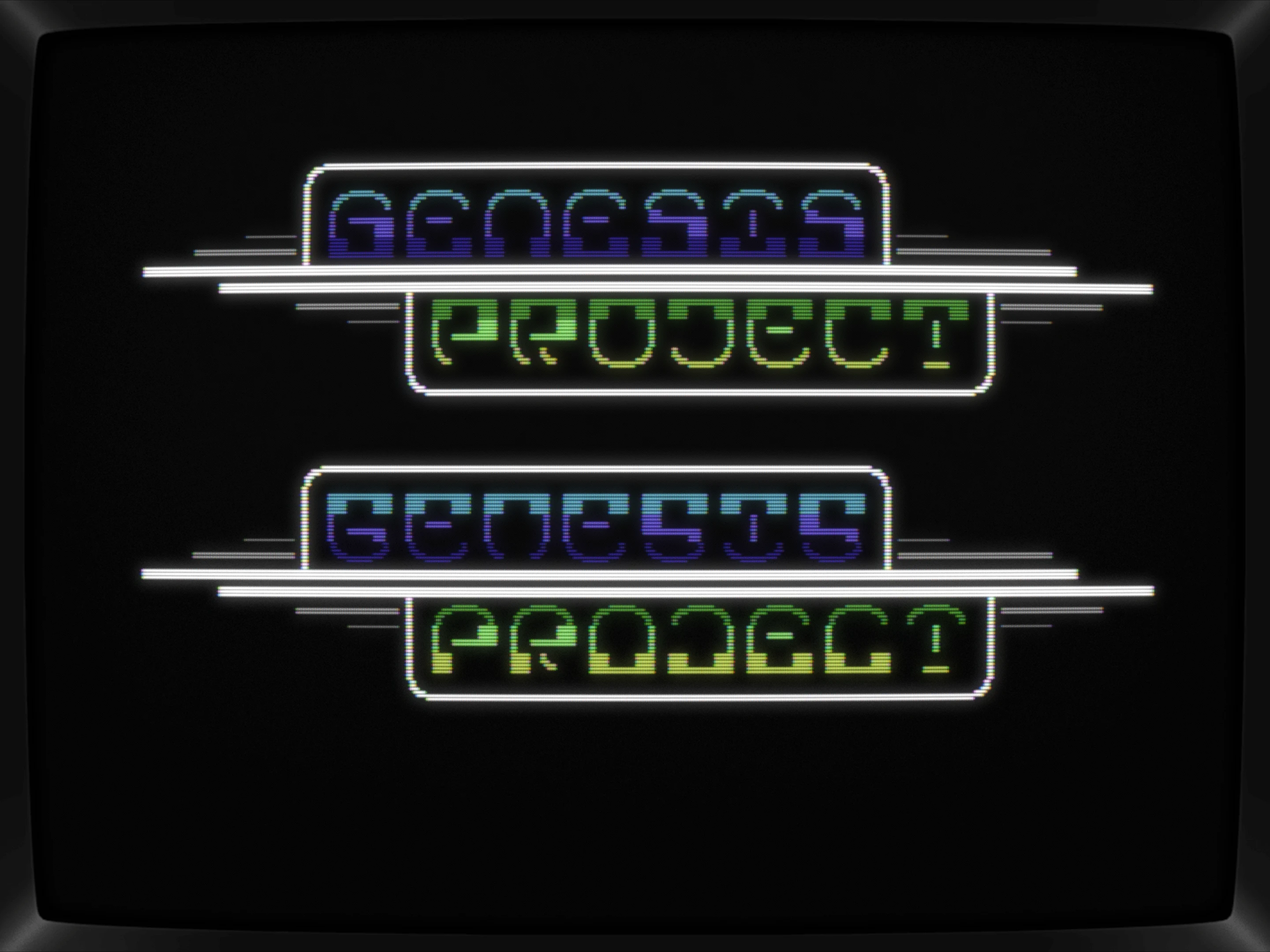
While pondering if it is indeed a worthy compo entry, I wanted to see how it might look when being used in a small intro, so let's add some space for a scroller.
Yeah, well, OK, maybe, but then again, a bit boring with all the janky lines being brought in order here.
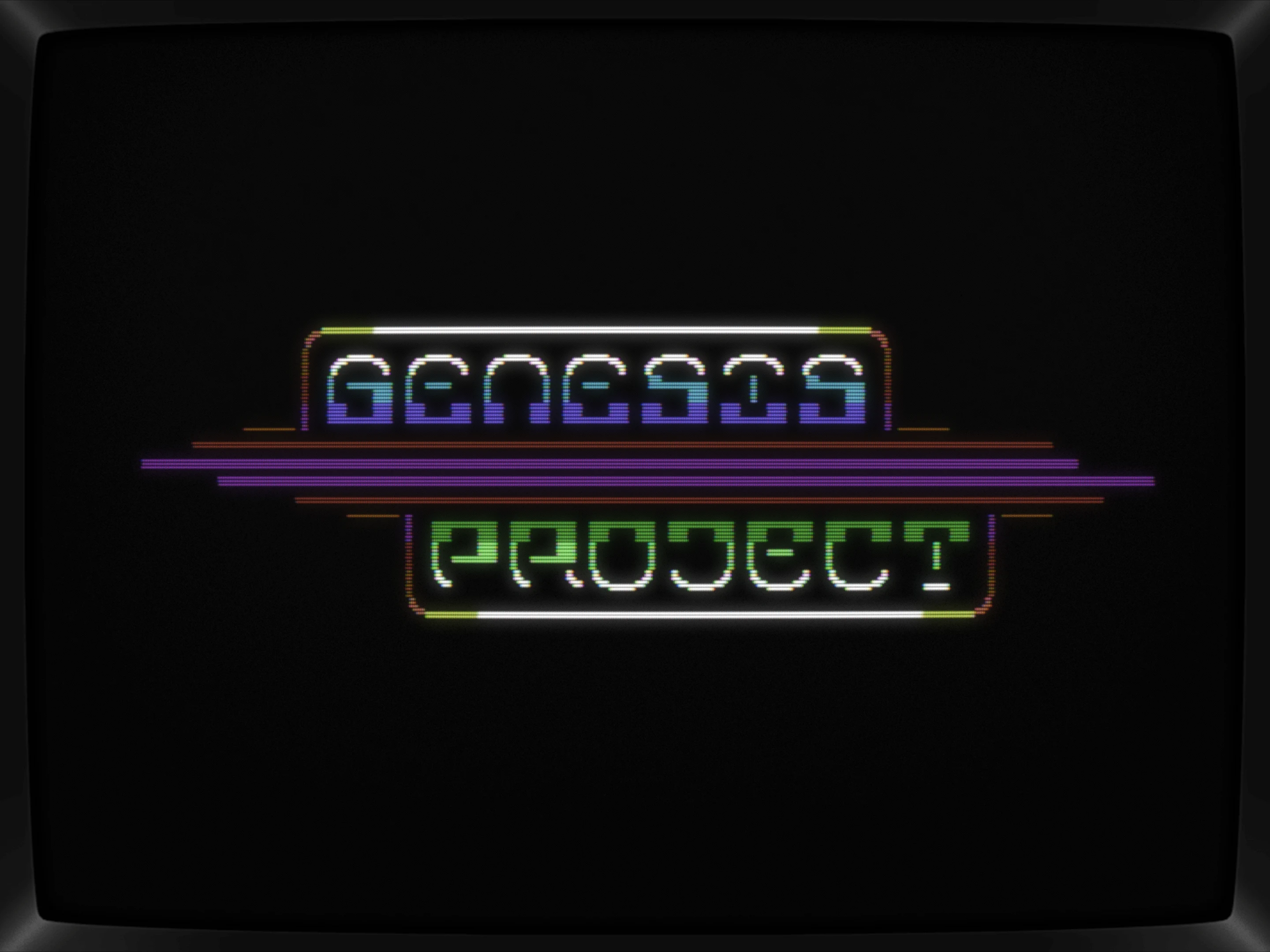
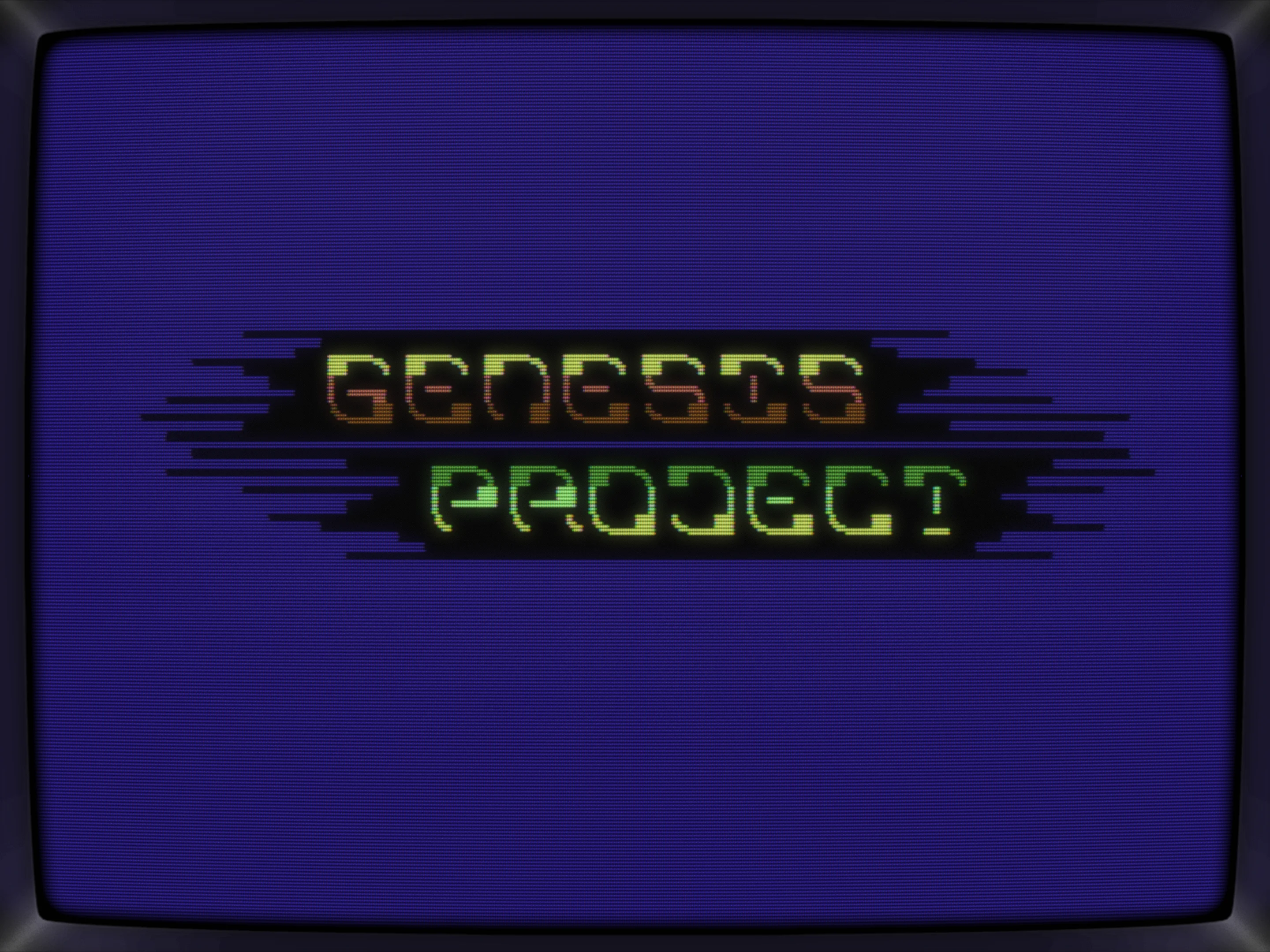
Here's a quick side-step, as the boring lines bothered me quite a bit. Let's just turn those lines' fuzzieness up a noth?
That's neat and in fact would animate nicely too with the logo swinging left to right and the lines changing lengths while doing so in an erratic matter. As a static pic, not really that inspiring.
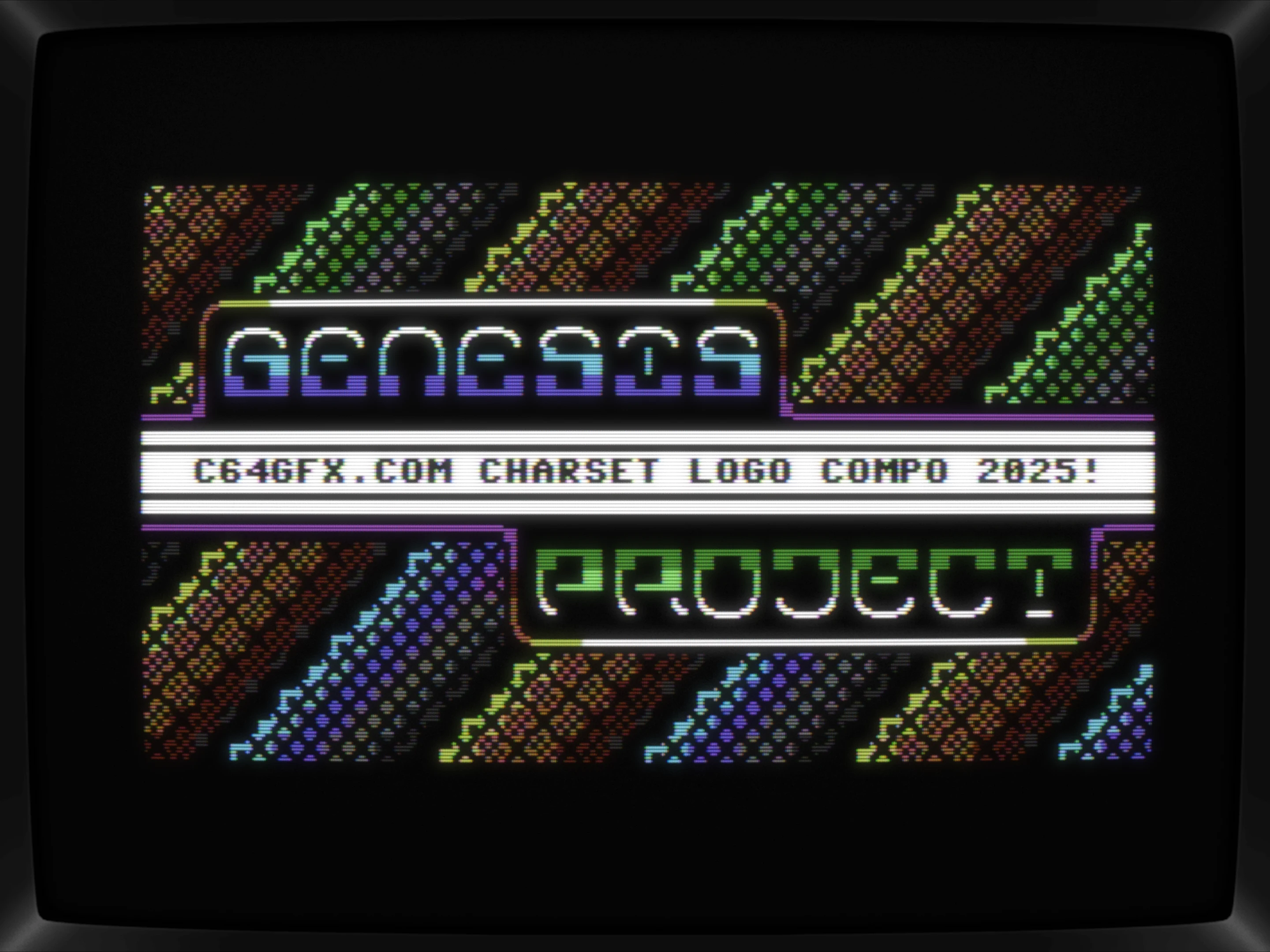
Back to the previous iteration and just throwing in a background to tone down all the straight lines and, yeah, that kinda works

Bringing the center line with the scroller back into the spotlight by turning it white; it's not there really, but this kinda lightens up the 3x3 font too a bit, creating a more balanced overall presentation.
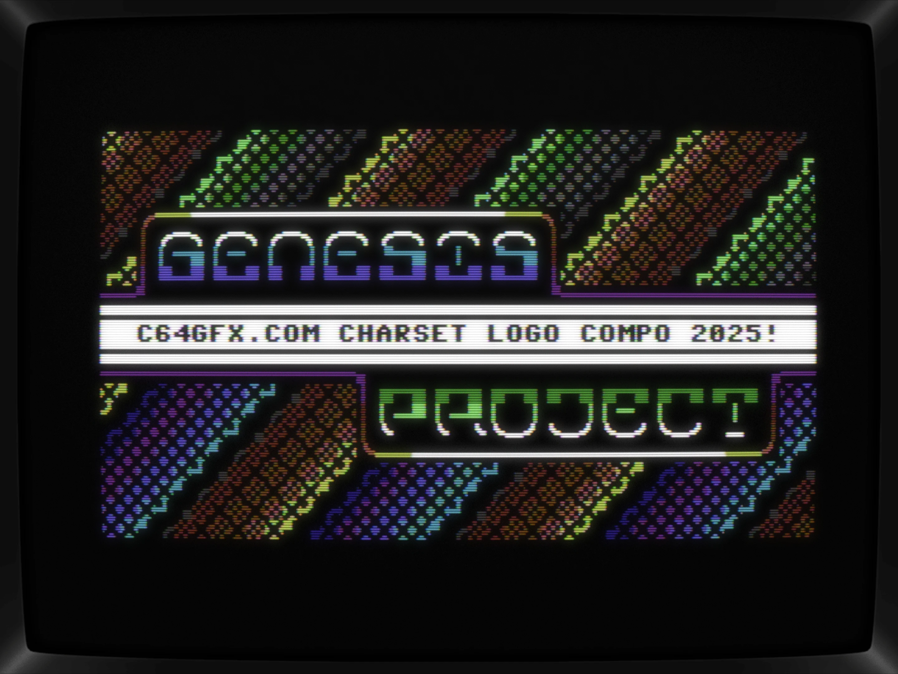
Changing up the backdrop a bit — which should/could be tweaked on end — but then again, those bars are moving in my head, so any details added would most likely go unnoticed anywhay, so let's keep it simple with the blue/green one reflecting the GP logo and the reddish one acting as a counterpoint.
Not sure if you've noticed, but I've changed the directions of the bars in this one to all look in the same direction. Again, thinking in a "that should move"-mode, I'd like to see these change in color incorporated in the bars movement while swinging left to right.
Conclusio
All in all, a fun doodle session with a (very) strong start and a neat mockup at the end. Submitted it 'out-of-compo', because it's not really just a logo anymore.
What's CSDb thinking about it
(05.04.2025)
Very cool! Ill analyze this later as I can already imagine some cool things to do with this in an intro.
@Raislin I'll send you the .pe file with all the variants in it later.