Layered
#? in "Mixed Graphics" at C64GFX.com CharSet Logo Compo 2025
How it started
A quick lunch break doodle: fooling around with positive and negative space trying to come up with a readable logo. It's nothing new really, and it kinda works, but in detail it doesn't.
With my Switch 2 still being on its way instead of having landed on our doormat on release day, I used my off-hours in the later evening for some more tweaks.
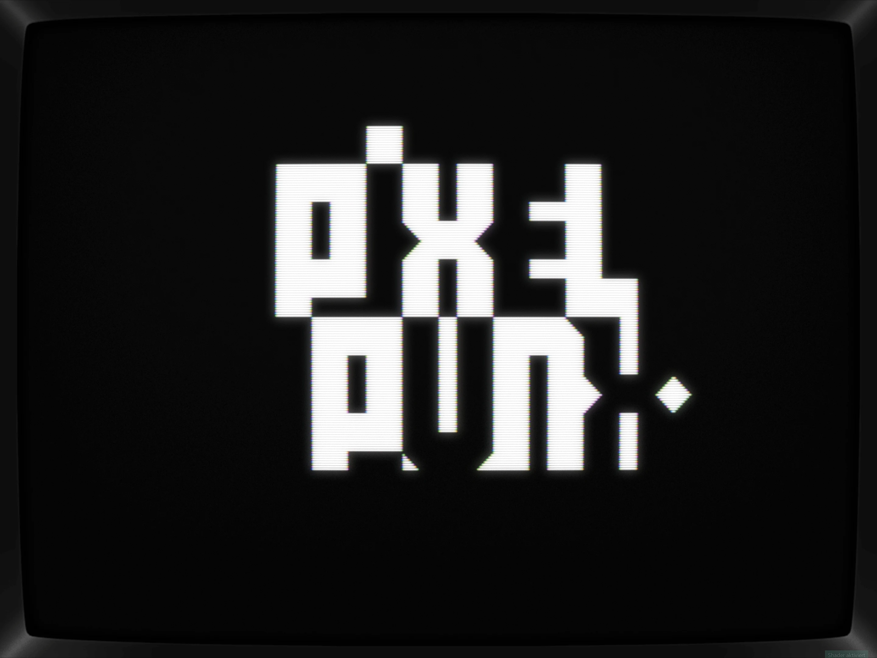
First, let's get it onto a single line and second, it does require a third color, so let's add a background:
While the Ps have been "fixed" by moving their vertical line out into the lower part, making the E and L to work visually was a tougher cookie. Sure, it's readable, but it's not beautiful with the L being too thick and too crunched at the same time.
Two more tweaks: Going for a lowercase E helped masking the L problem and layering the U and N gave two additional rows to go all-in with serifs. Neat.
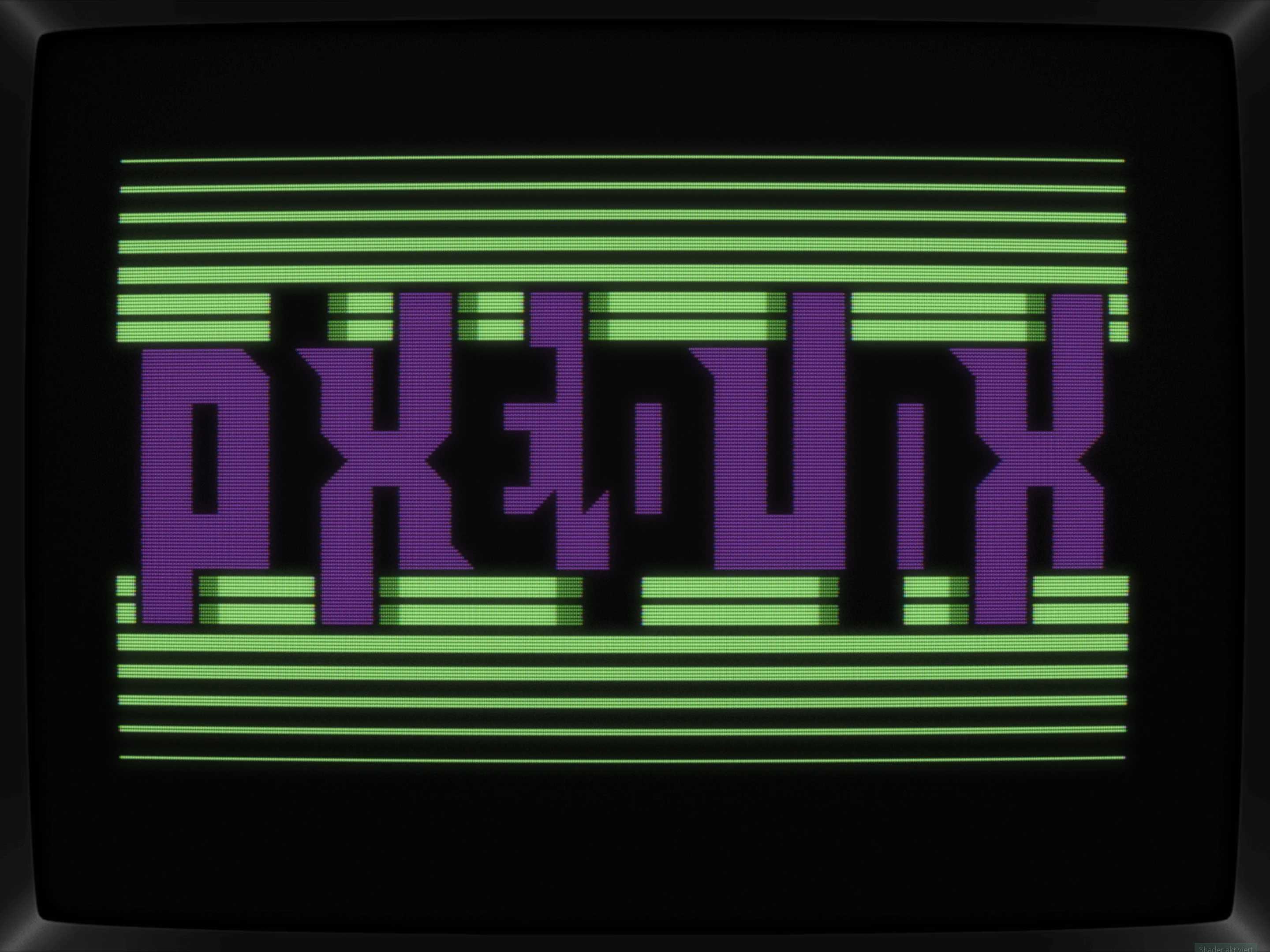
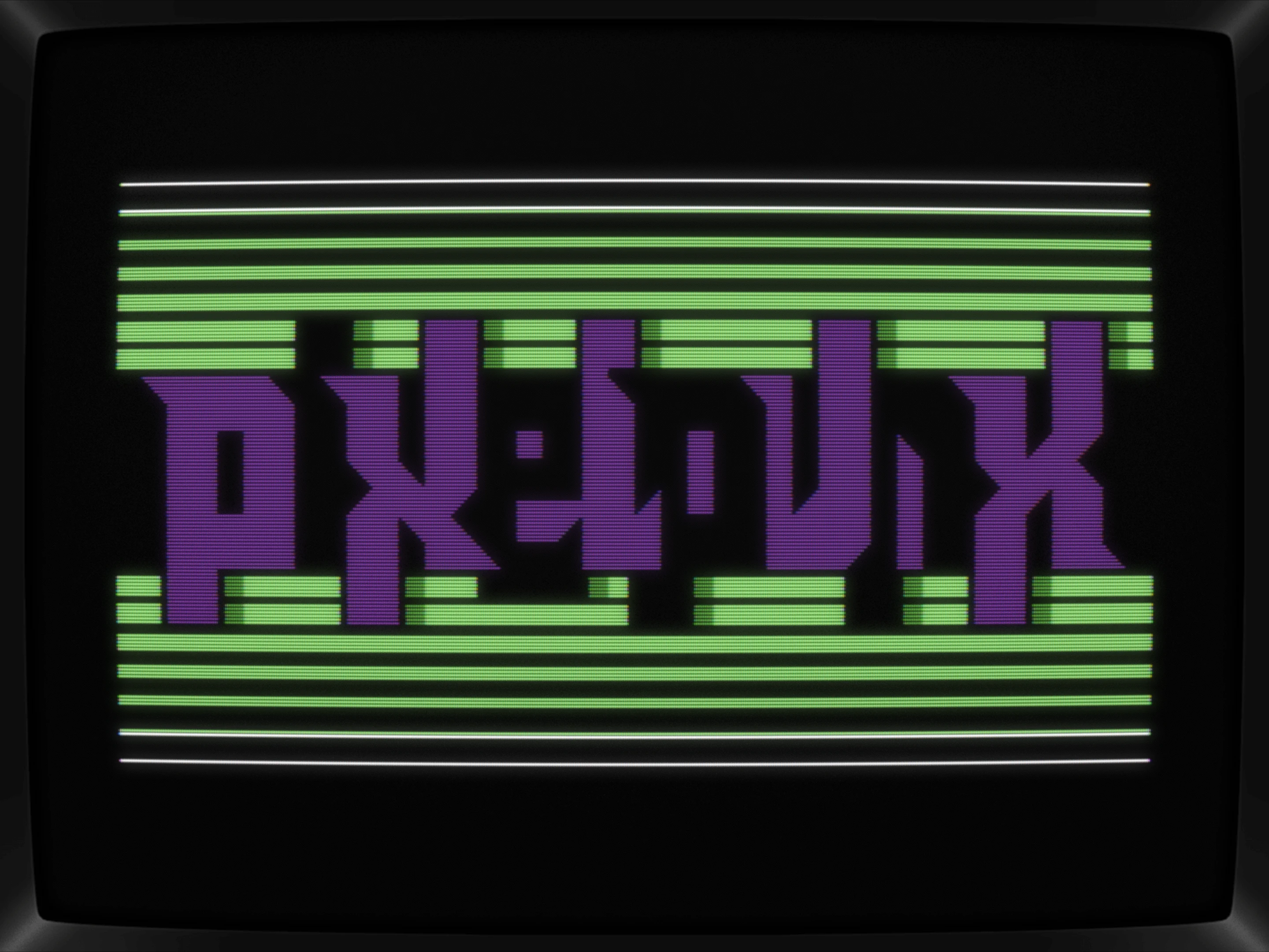
The green background was bumped up a bit too with mixing in some white.
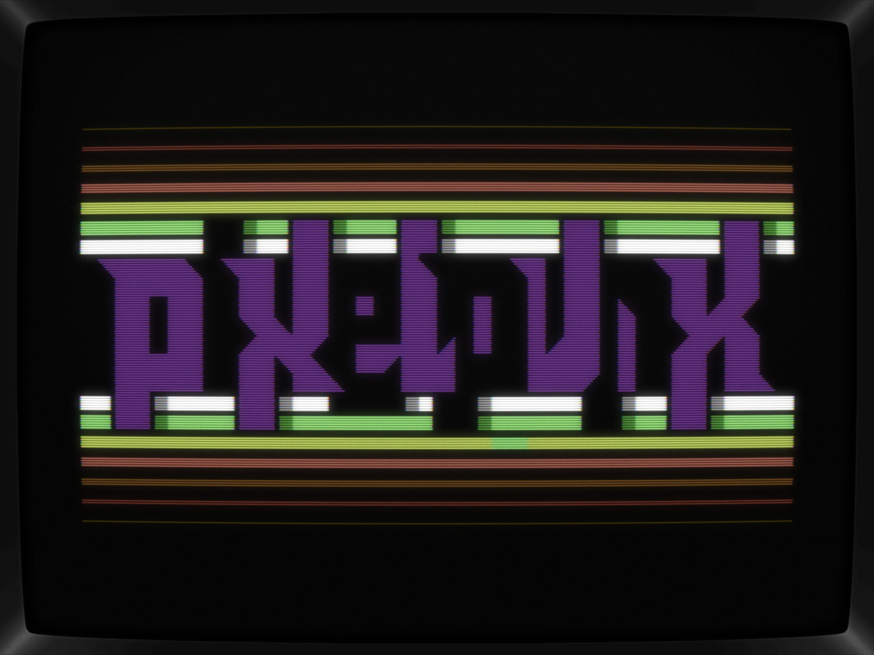
With friday's lunch break being on a home-office day, I thought about using my minutes off for releasing the logo but, you know, the purple didn't hit as hard anymore, so I fooled around with a colored backdrop and after some variants, just went for a smooth gradient. The light green is still there, not really fitting in but then again being just perfect at the same time. Let's keep it in.
Conclusio
Simple, but fun pic.
What's CSDb thinking about this production?
(06.06.2025)
Very nice
(06.06.2025)
Dude, next level again!
(06.06.2025)
punx not dead! looks good!
(06.06.2025)
cool idea and nice colors! :)
(06.06.2025)
great idea, looks awesome!
Thx, guys <3