FairlyPhat
#? in "Mixed Graphics" at C64GFX.com CharSet Logo Compo 2025
How it started
The exact origin of this logo is hard to pin-point because it kinda came to be due to multiple triggers.
Holy Moses' PETSCII pic Missing Something... got me thinking about how to fool around with the C64's default appearance: light blue border, dark blue background. Very basic and hard to mix up except when adding a border to the screen. Holy Moses had an outline for his puzzle pieces, allowing the border to bleed into the screen and I was intrigued.
For a not yet released project, I followed up on this idea, giving the screen a border and stray from the usual rectangle form and, well, that's where the shrunken down screen came from for this logo; I did keep it rectangular though.
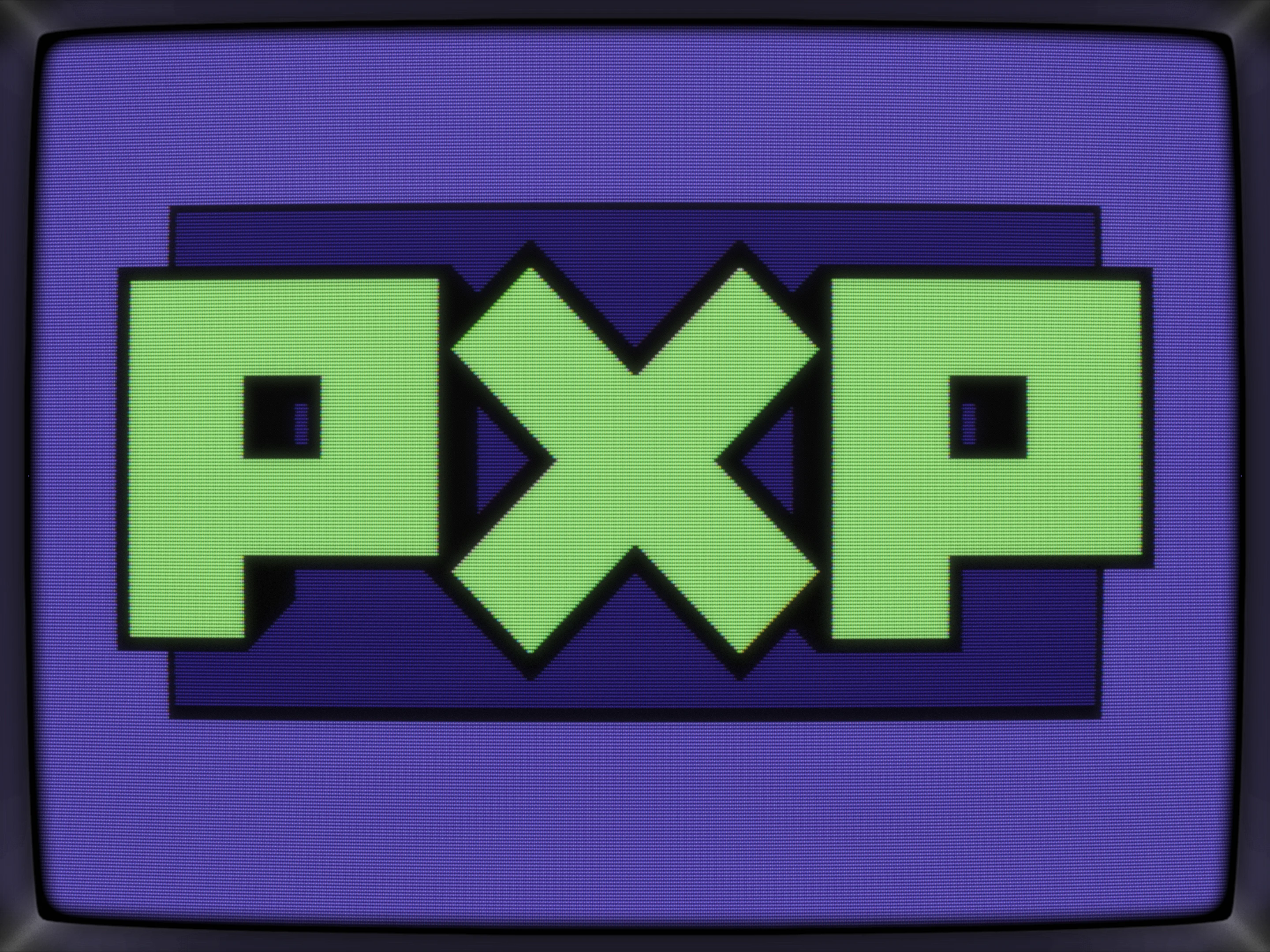
With the background screen and it's newly established size in place, I had to somehow break out of it. Well, nothing easier than having a logo pop up than making it 3D and that's really all that's happening here: I painted the biggest PXP possible and added some 45° chars for the 3D effect, going from 2 chars to 1 char to no extra char on the X.
Adding the 3D wasn't that hard either but it required a couple of iterations to keep it smooth where the Ps and the X touch.
There's only onen workstage saved in my .pe file, and it's more or less the finished pic but slightly bigger:
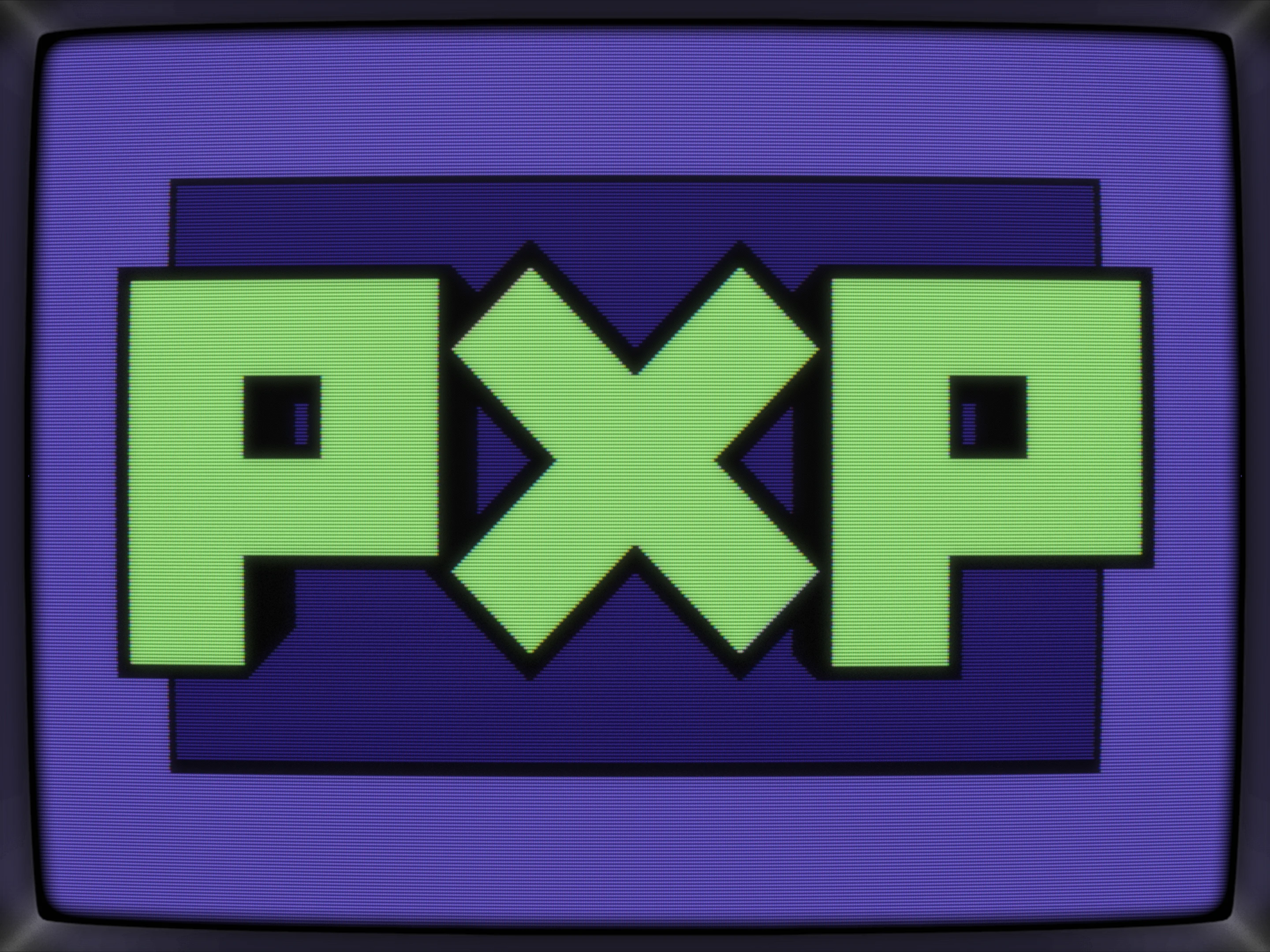
Next up, tweaks. In this case, it was just a matter of changing the height to give it some more punch and that's it.
At this point, I had to decide if the logo's gonna be a part of the not yet released project or if I just throw it out there as an entry for the currerntly running C64GFX.com CharSet Logo Compo 2025 and, well, after letting it sit for a week or two, it got released as a logo.
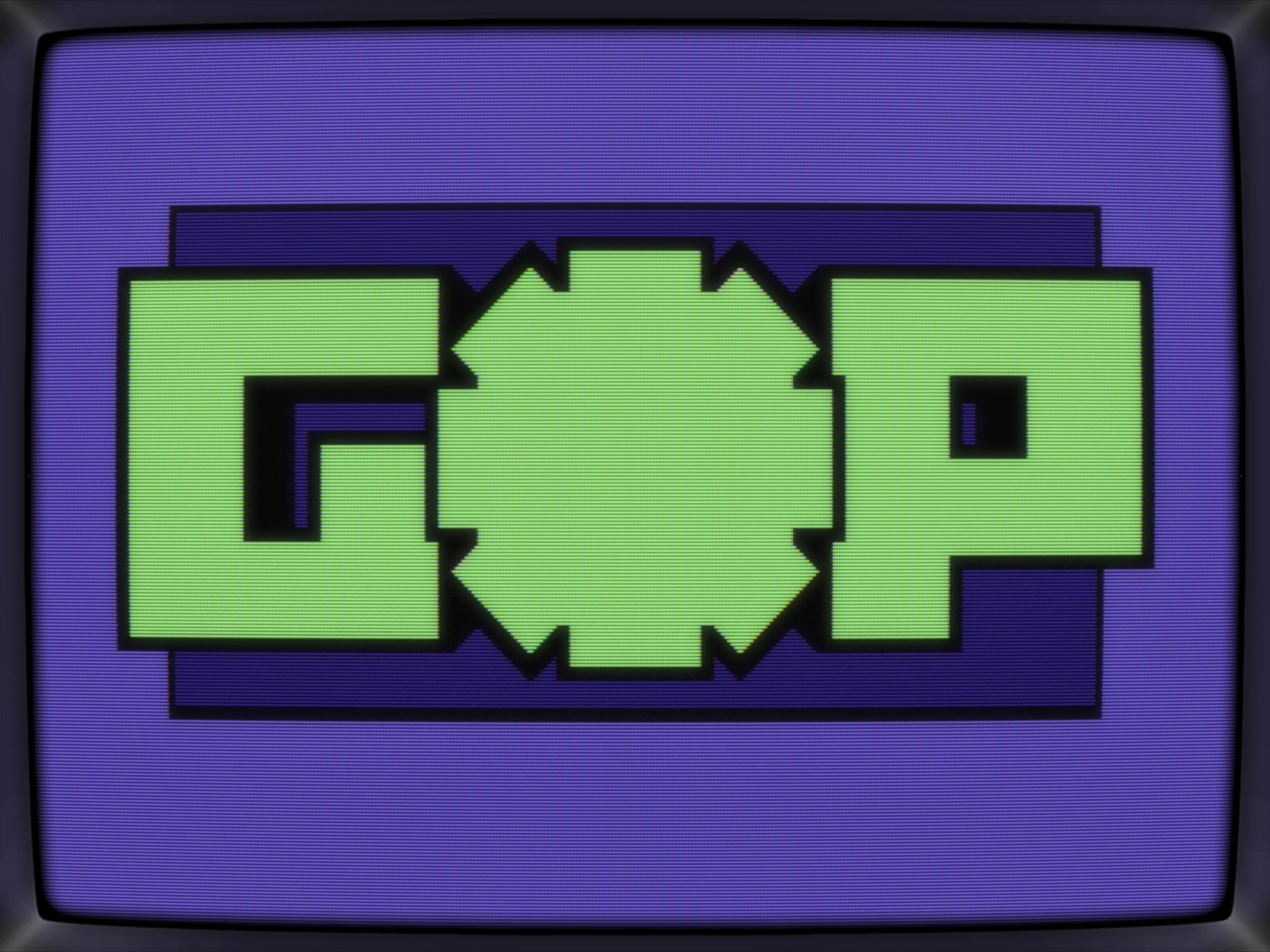
With the compo being run by Raistlin and him being a member of Genesis Project, the idea of turning it from PXP into G*P came about, I mean, it's almost there already and the X should work as a * perfectly too
Here's the G*P variant and I like it, especially the big * in the middle but the G just looks plain boring, so let's scrap it.
Conclusio
It's simple, very simple, but slick due to it's high-res nature. Pretty sure, I'm gonna revisit it someday and add some color effects/pattern/cycling or something, maybe a scroller underneath and thus turning it into a little intro. When? Well, once I've learned some more ASM :D
What's CSDb thinking about this production?
(20.06.2025)
Smooth!
(20.06.2025)
Crystal clean and phat!
(20.06.2025)
So phat!
(19.06.2025)
technically so simple, yet so effective, cool idea and execution, thumbs up!
(19.06.2025)
Cleanest PETSCII logo ever
(19.06.2025)
Readability deluxe!
(19.06.2025)
\o/
jmin (19.06.2025)
Woops.
IMHO, PETSCII should be set as default anyway :D
(19.06.2025)
Swapped this to PETSCII as it's, umm, PETSCII :-)
Thanks, Pholks!