Mixin' Maze

Preface
This one is a bit of a mess to reconstruct because I've worked on multiple PCs and didn't really sync my .pe files. Main reason is that I've fooled around with the idea during my lunch break at work where I can't really export any .pe files. In most cases, just start another file on my private PC later on and recreate any idea worth following up from earlier that day. Saving and re-importing via .png is possible, but I'm often too lazy for that, especially for smaller ideas. Anyway, let's dive into the stages that I do have saved.
How it started
The PETSCII triangle shapes are very versitile, and I thought I'd want to experiment with them a bit more. It all started with a simple line where I recreated the the core idea of t0m3000's t0m3000 picture: a gradient with triagles going from a char color via bg color to another char color in a single vertical line.
While I fooled around with this for some time, doing vertical/horizontal lines wasn't really what I had in mind, and I started to add turns to diagonal lines. This is rather easy in PETSCII, but IMHO, it's not really good looking with the vertical/horizontal lines just being a pixel too wide making the line uneven. Sadly, I don't have a screenshot nor .pe files with those lines, but there was't that much to see anyway and also nothing going beyond t3k's picture. Nice practice though, and learning how something is done is never wasted time, right?
Going back to diagonal lines brought me to an idea that clicked right away: when viewing a diagonal as wall, there would be two sides that could be shaded using the light/dark variants of a color, and after a couple of minutes later, I ended up with this:
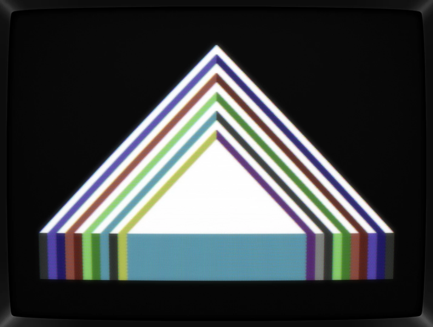
Now, we're talking! After doing an X and squares, a huge triangle could be the next installment in a "shapes"-series!
Here, a couple of iterations are missing, but those boring parallel lines had of course to be varied, and thus I've added some corners. This also allowd to mix all colors resulting in a more interesting picture. I think, I've ended up with this one next:
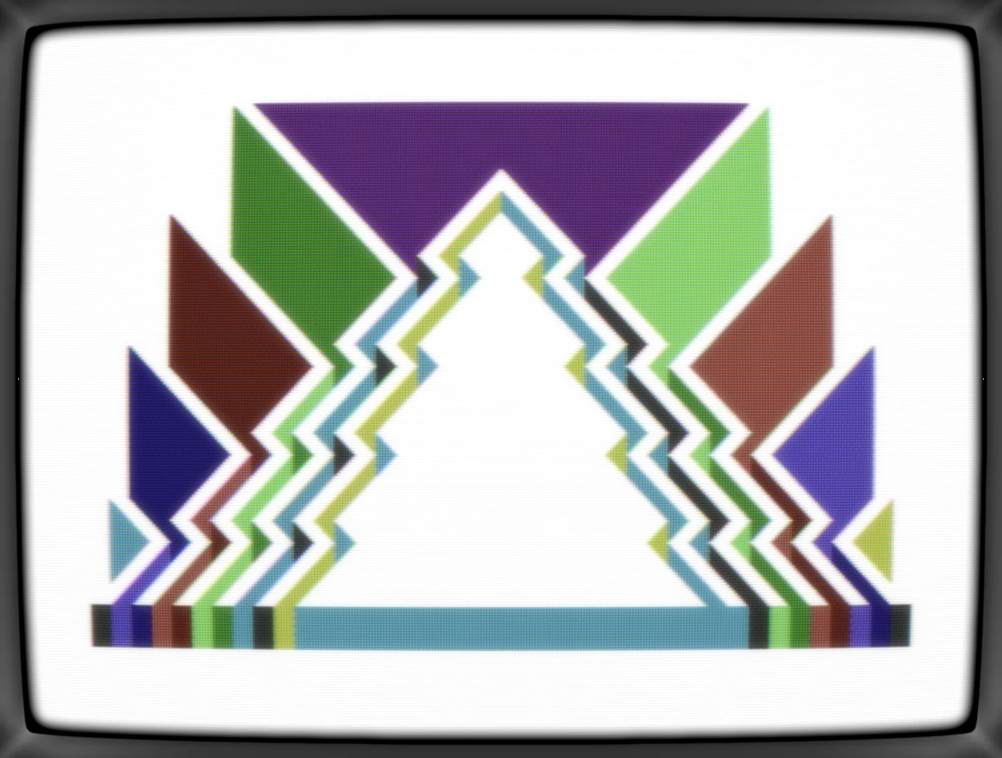
The shapes bordering the triangle were just filler, but the variations of the diagonals did work although it turned the triangle into a christmas tree, really. I'm not the only one seeing that, right?
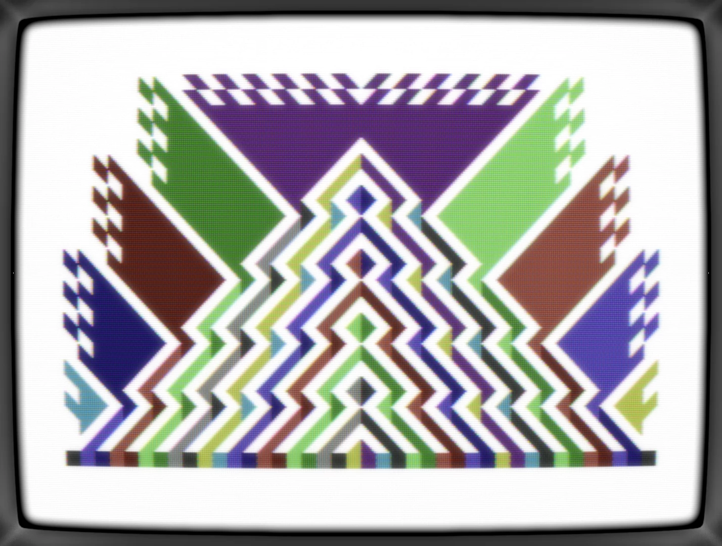
More lines were added in order to remove the tree and to add more colors. Also, the flag-like walls on the side were enhanced with details in order give them a reason to exist. The Christmas tree isn't there anymore, but it now looked like a piece of paper that had been folded up while the paint was still wet. Neat, somehow, but that's not enough.
I've been doing quick & dirty scene group logos the other day, and having a huge triangle on the screen does, of course, put 'TRIAD' in my head all along, so why not turn this shape-thingy into another group logo then? Here are a couple of variants that poped up with edits of the background and a very basic font:


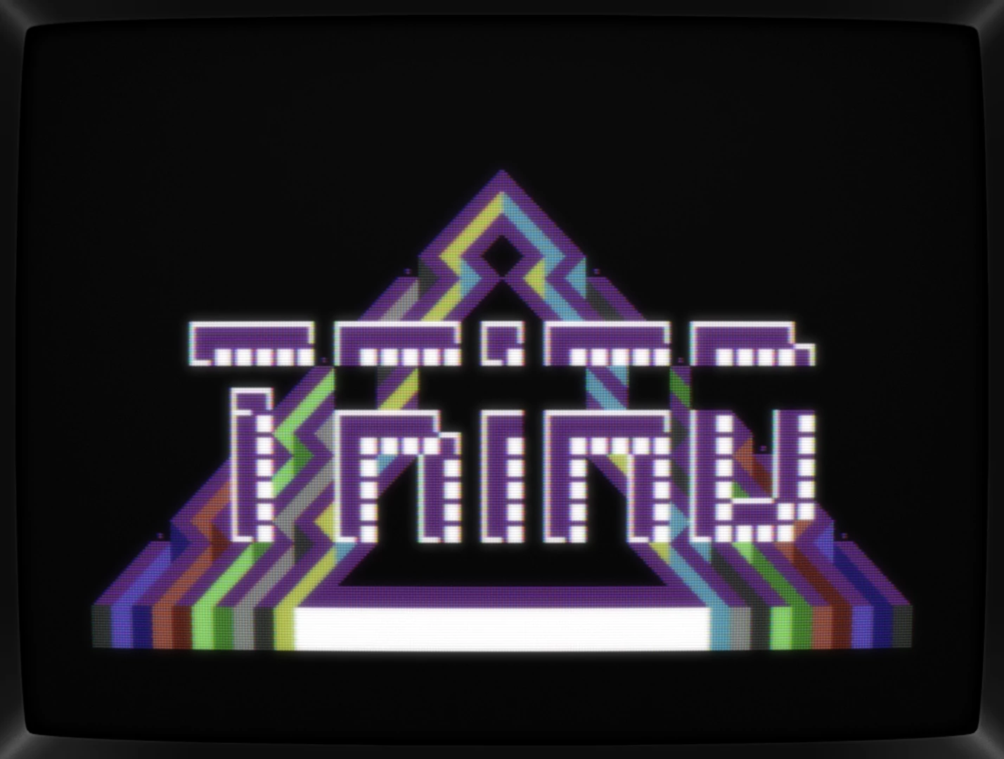
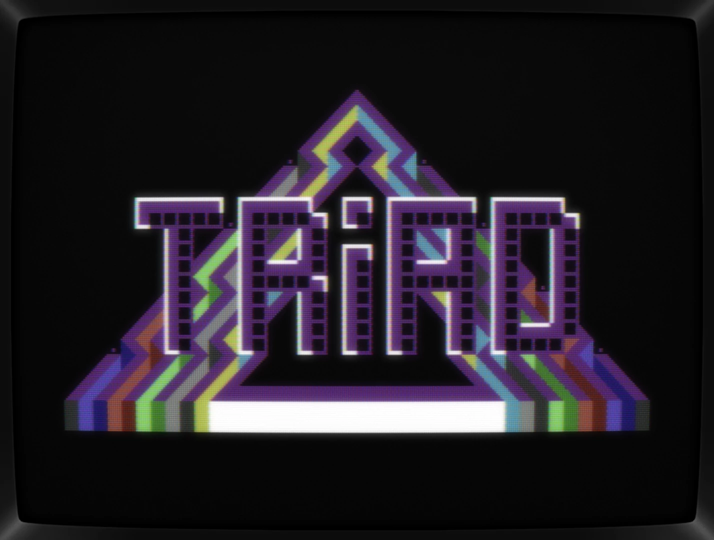
Ah, shoot. It's not going anywhere, really, so let's take a few steps back and slap a font on the fullscreen flagged triangle one and call it a day.
Pixeling away...
After a good night's sleep, I'm still intrigued by the triangle, so let's get rid of the font and restart fooling around with those walls:
First, let's fill the triangle in a more inspired way, avoiding any christmas tree to pop up again and let's break those walls up some more in order to allow more colors to shine.
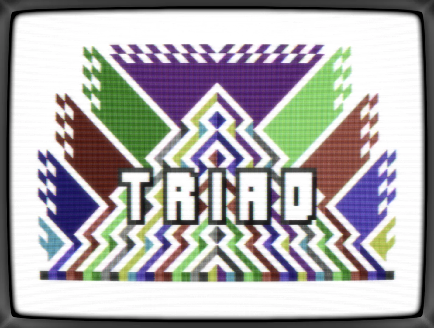
Next, let's add a logo, but this time, it's a 'jmin' pic again. When chosing my handle, I already had it in my mind as a bunch of parallel lines (hence the 'a' that I've skipped), so let's just add that to the triangle:
OK, now we're talking! At this point, a couple of variants are missing because getting into the zone and remembering to do workstages isn't something that's compatible. There were four or five different font styles, with and without connetcting the chars, adding dots and mixing up the lines' length. Here's a screenshot vie micro64 that I've shared along the way but sadly don't have in my .pe file anymore:

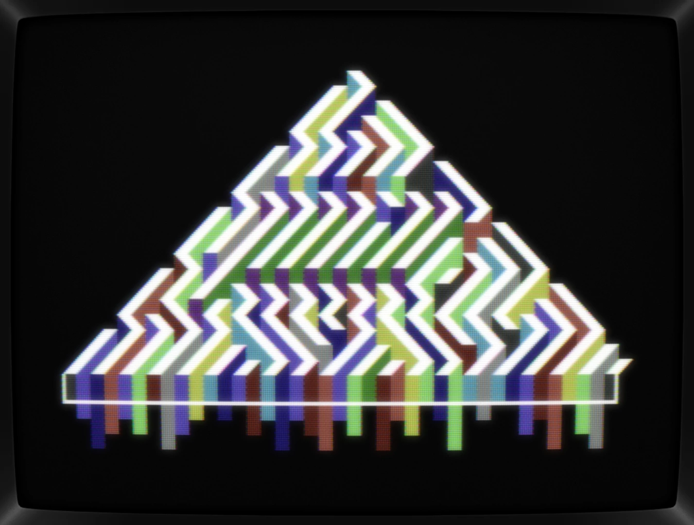
In the end, I've settled with a more readable one by adding a horizontal connection for the 'm' and 'n':
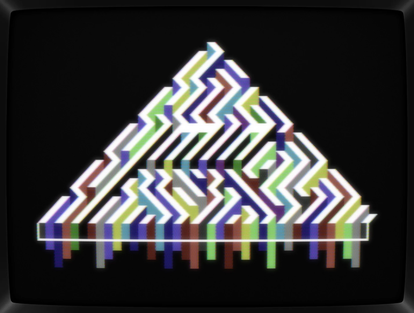
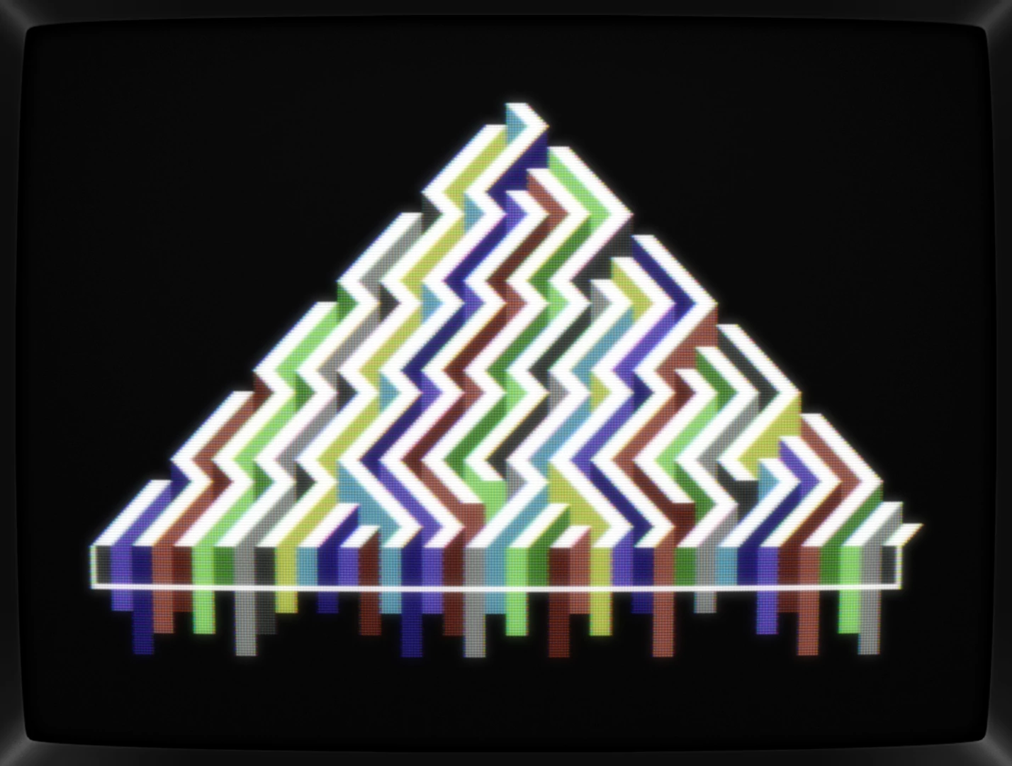
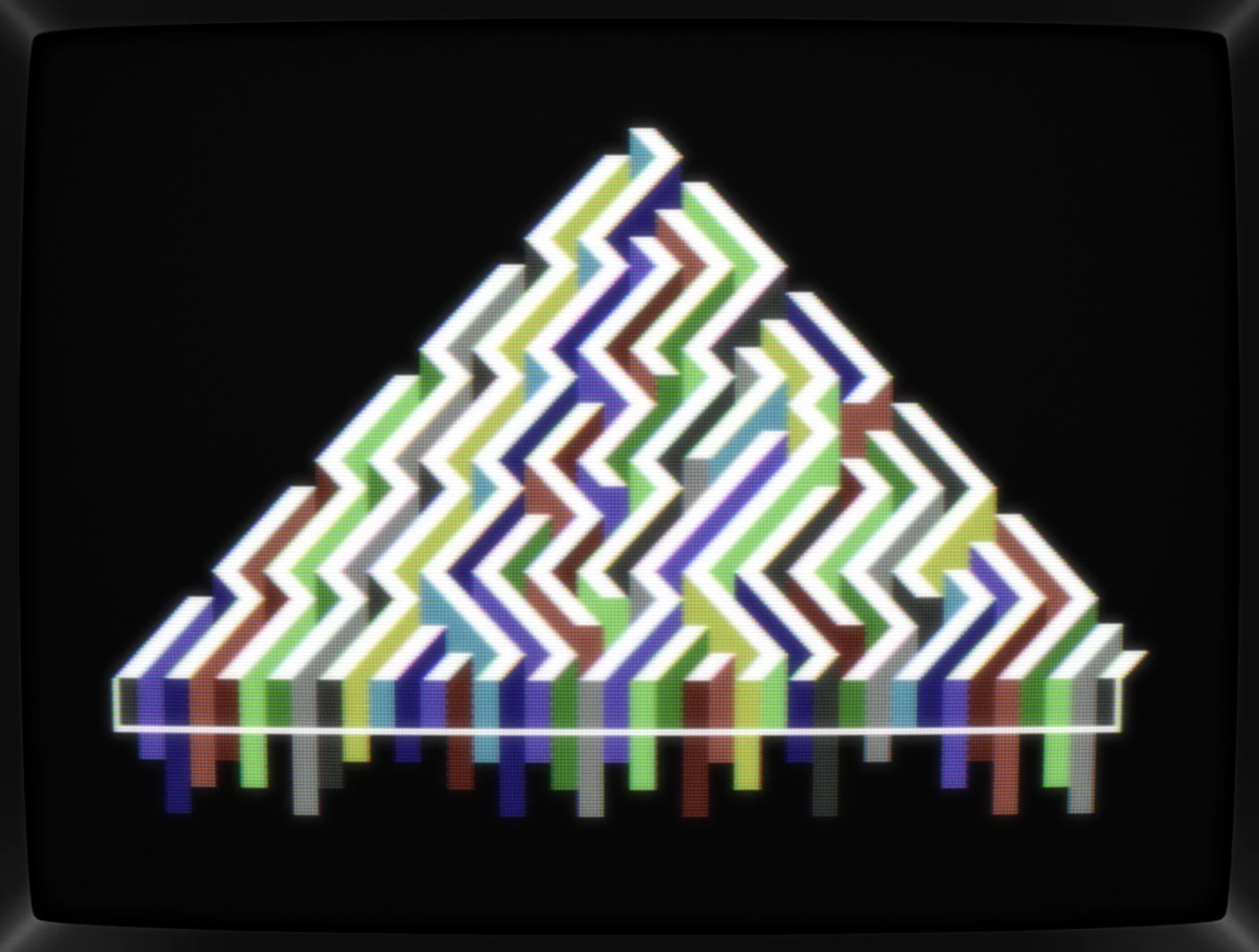
At this point, I was rather happy with the colors as well as with using black for making the logo pop, but what if I'd swap black & white, maybe the colors would started to light up more?
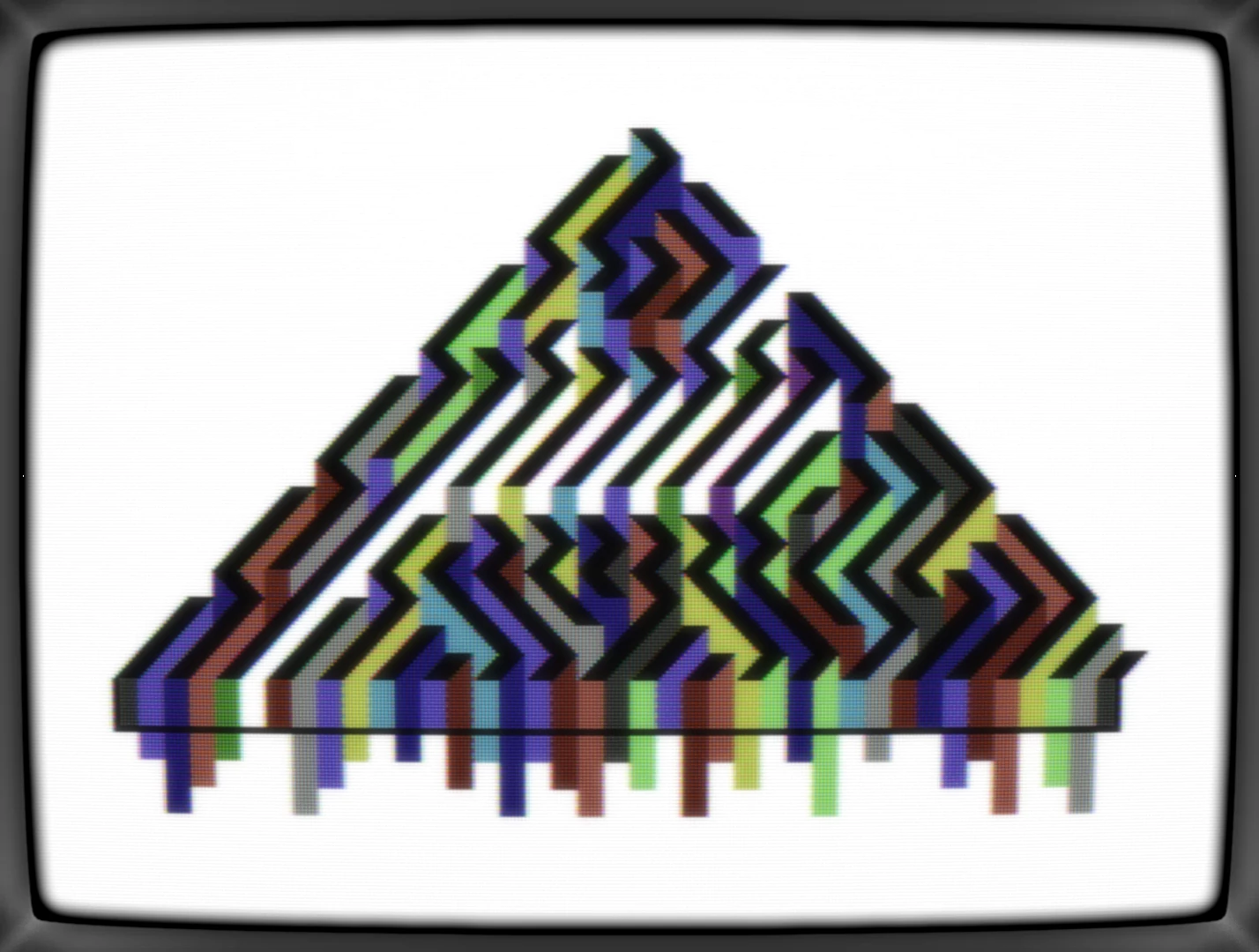
Yeah,.. nope. The photo negative look is interesting, but overall, it's a not working at all. Way too busy and messy. Let's go back to black background — well, 'background' because black isn't really the background color, but you all have figured that one out along the way already — and tweak those colored walls some more:


Last minute idea
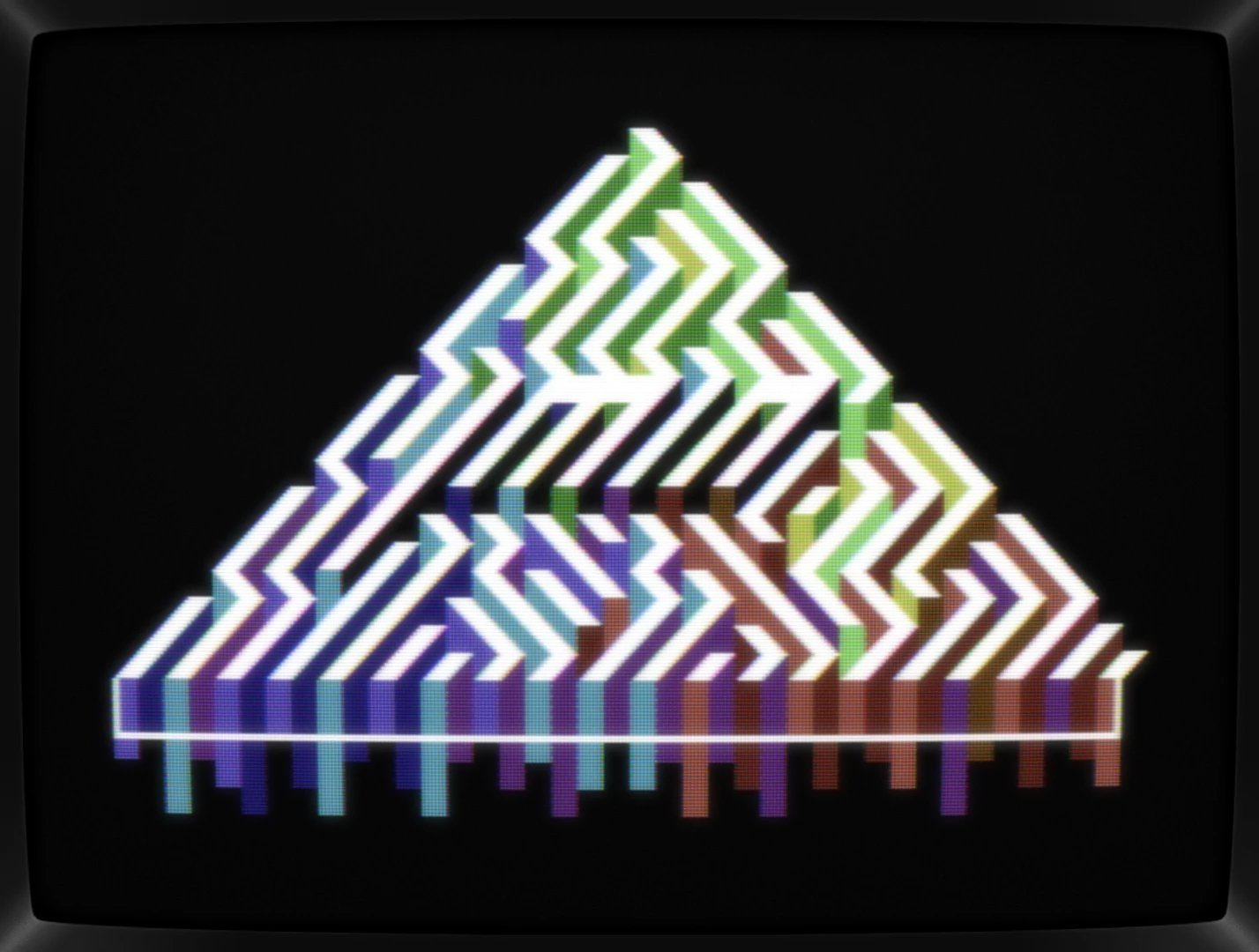
Perfect! Happy with the result, saving all files needed for a release and ... wait a minute! How about giving those colors some order? How about assigning each tip of the triangle its own color? How about doing a RGB-mixing thingy? Quick, let's google that RGB-mixing thingy, that gotta have a name and defined color order!
Yep, let's do a "Maxwell color triangle". With blue, green, and red having all their light/dark variants, that could work out, and here's what I've ended up with a minute or two later:
Fantastic! Save it, screenshot it, export it and release it!
Conclusion
Oh boy, what a ride, but that's exactly why I've fallen into the C64 pixeling hole. Starting doodling, experimenting, or just having some fun really, and with a bit of luck, a path materializes to follow, leading you to something exciting. In my case, a bit too exciting, because once again, I've released a buggy pic, but this time, I'm not re-releasing a fixed version. Those two characters aren't worth it.
Here's the fixed picture with a tiny change in color too:
What's CSDb thinking about it
(29.03.2024)
I love how you have highlighted the "jmin" logo from the maze. looks great!
(29.03.2024)
This is phenomenal <3
jmin (25.03.2024)
@katon Yep. Would have been way harder if I hadn't skipped the 'a' in my handle ;-)
@raistlin Already started shifting things around. Never though I'd end up with that many pics. Having a hard time with multi-color, so that's gonna slow things down dramatically /o\
@jab Haha, yeah, right. I'm like n° 9,998,383,750,000 on the list for that position, but thx!
(23.03.2024)
jmin for PETSCII president! <3
(23.03.2024)
I see your nickname at the top, right?
(22.03.2024)
Fantastic! Hope you'll move this one -into- the compo - though I realise you then need to choose one to drop out :-)
Amazing stuff here :-)
(22.03.2024)
omfg! amazing!
jmin (22.03.2024)
Thx, y'all!
That the background doesn't have to be in the background color is somethng I've learned studying W1's (fantastic!) <CSDb release (239775)> and have (mis)used ever since. It's of course old news for most of you, but happy it's still so effective nonetheless.
(22.03.2024)
Great!
IMHO white border at the bottom is unnecessary.
(22.03.2024)
Amazing, love it !
(22.03.2024)
Nice!
(21.03.2024)
<3
(21.03.2024)
Feels impossible for pure PETSCII, great discovery Ben!
(21.03.2024)
I repeat: awesome!
(21.03.2024)
smart!
at first glance makes you think of ECM until you notice what's real $D021 :)
(21.03.2024)
and the background is not black ;)
good work!
Operator Teleksu (21.03.2024)
awesome
absolutely my PETSCII favourite in the compo! this one is so cleverly done and really beautiful!